Client
Walk with Tito, with Virtualna tvornica
Brand identity and website for a Zagreb walking tour following the Yugoslav partisan movement through the city — bold enough to be remembered.

In Zagreb, a walking tour about Tito arrives with an audience that already has opinions. A visitor might know the name from a documentary; someone local more likely knows it from their grandparents, and the two versions rarely match.
The client was explicit about what she didn't want: nothing tidy, nothing uniform. Something memorable, a bit provocative, enough to stir things up. In a market full of castle-and-cathedral walking tours that was also the commercial argument, so the work had to be bold enough to be remembered and careful enough not to answer a question the tour leaves open.
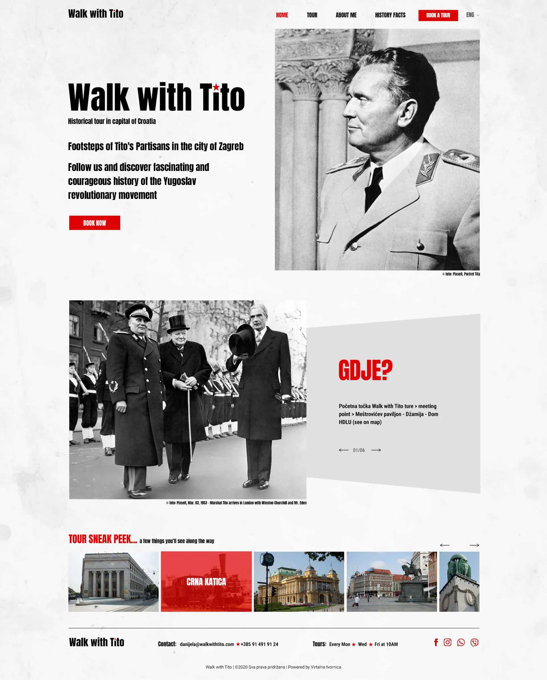
The visual language borrows from the era it's about, but doesn't imitate it. The wordmark is set in a heavy condensed grotesque, the typeface of newspaper headlines and printed proclamations, but in sentence case rather than capitals, so it reads as an invitation and not a slogan.
The only loaded element in the entire identity is the red star, and it appears at the smallest size available to it, as the dot over the i in Tito. Nowhere else.
A star beside the name would have been a declaration. On top of a letter, it's just punctuation.
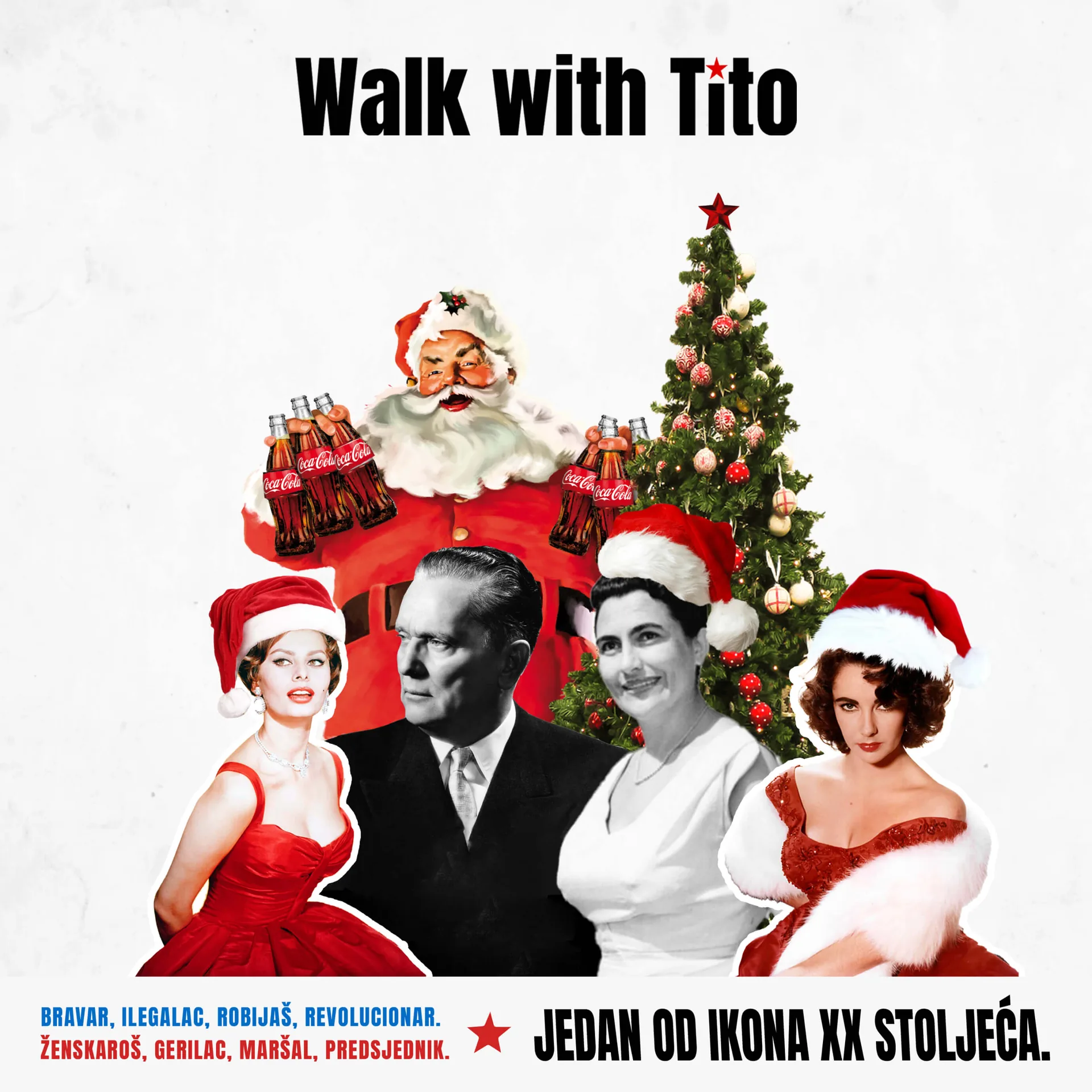
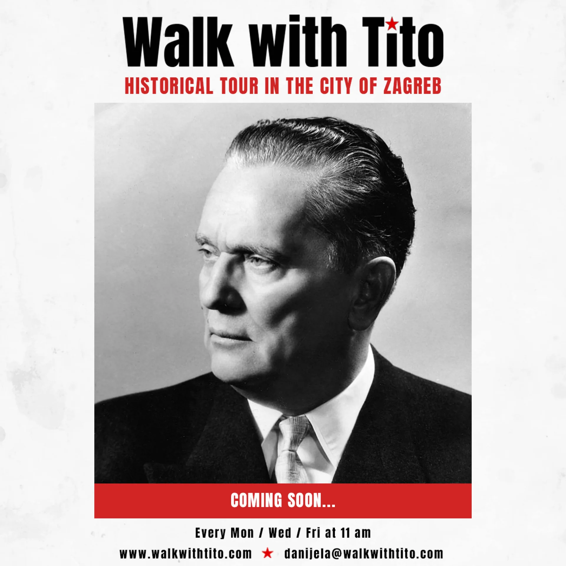
One set of artwork runs across the flyer, the tickets and the social posts. Every collage carries the same run of epithets: locksmith, undercover agent, convict, revolutionary, womaniser, guerrilla leader, marshal, president. One of the icons of the XX century. All true, in no particular order, ranking none of it.
The images work that way too. Archive photographs, cut and recombined rather than reproduced straight, place Tito among film stars, monarchs and revolutionaries, where he reads as a face from the century rather than a politician to settle scores with. A faithful reproduction would have looked like a tribute; a collage is a comment.
The tickets manage it in five words: discover Yugoslavia, a country long gone. Curiosity rather than nostalgia, which is the only thing a tour can honestly sell about a state that no longer exists.
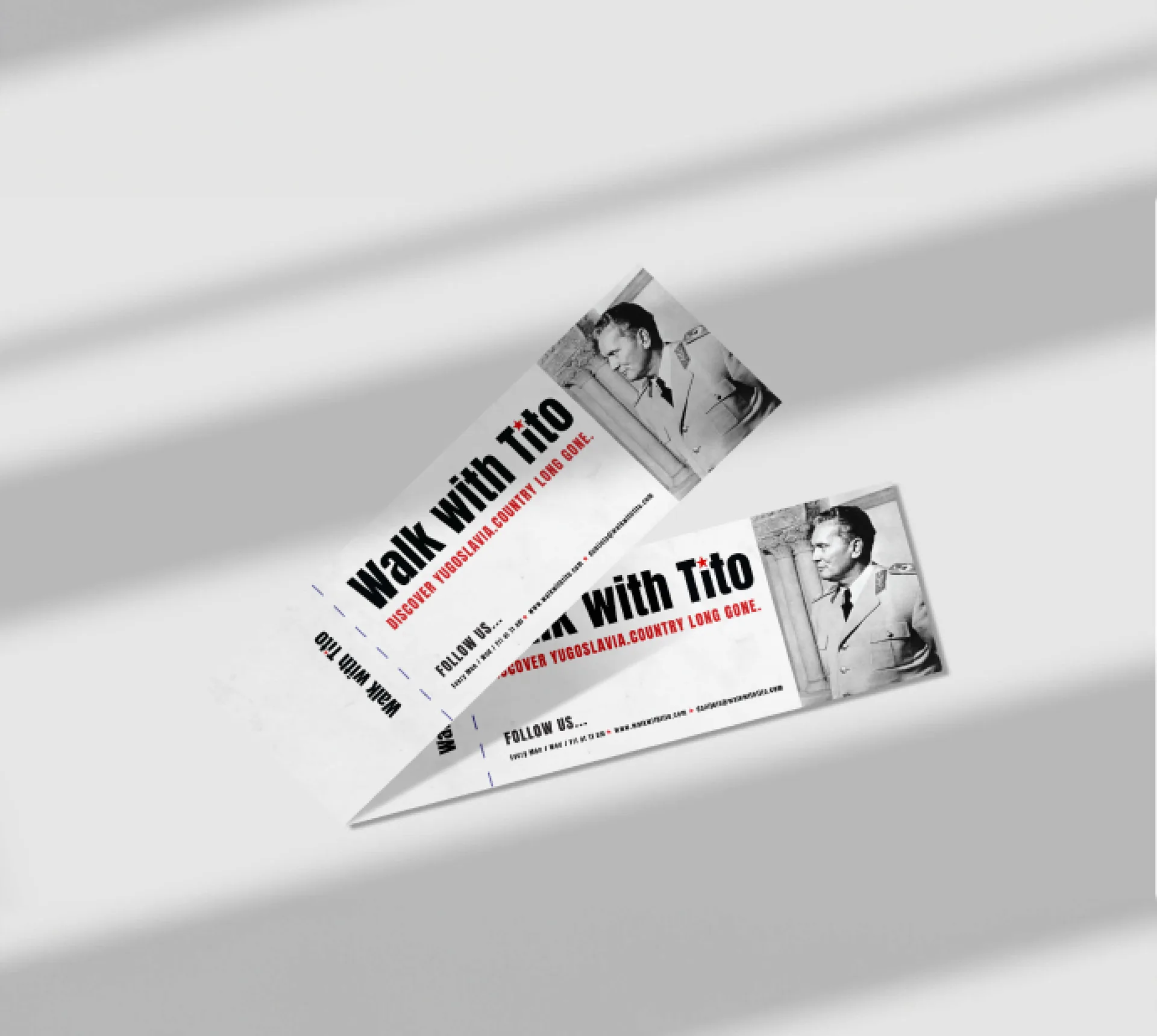
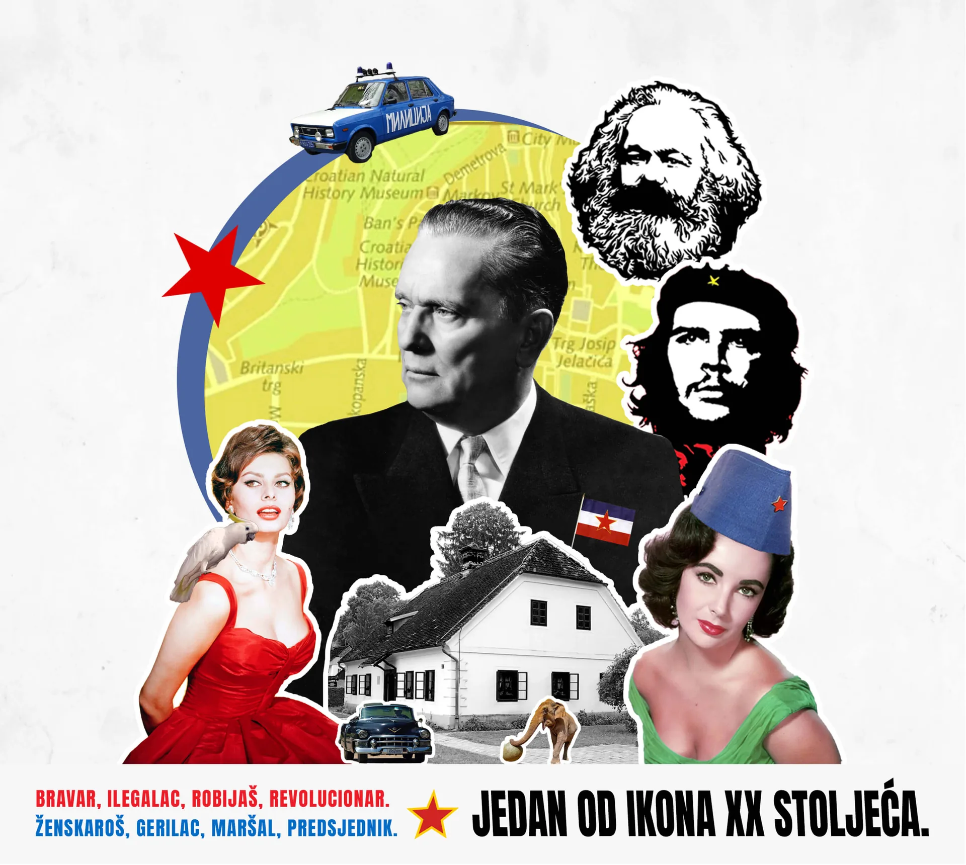
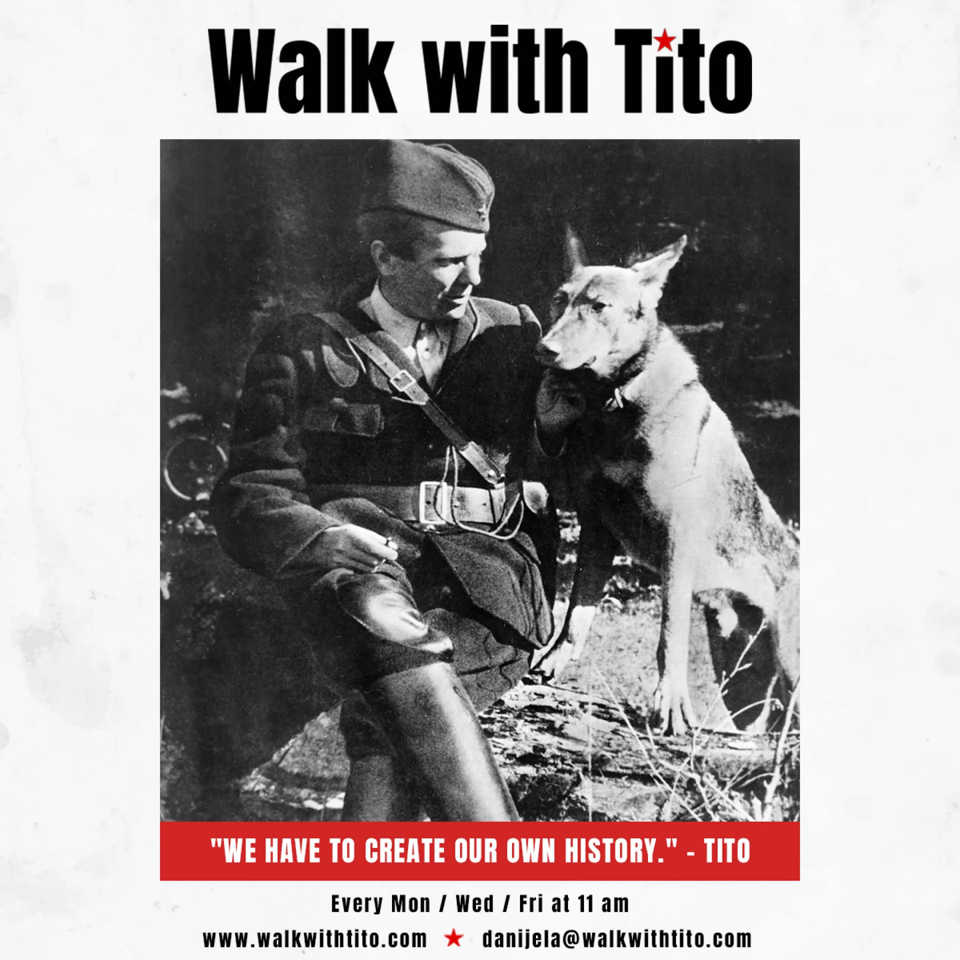
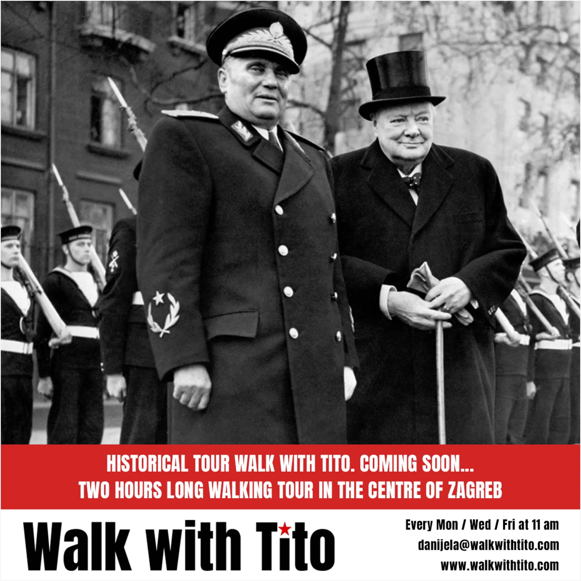
Paper texture, black-and-white archive photography, and red only where something needs to be done. The palette does the period work so the layout doesn't have to, and everything runs in English and Croatian, since the tour draws visitors and locals in roughly equal measure.
Booking is never more than a step away, and the History Facts section gives the site a second job, so it's something to read before or after the walk rather than a booking form with a homepage attached.