Client
Pedal with Heart
Visual identity for the sixth charity bike ride in Jastrebarsko, in aid of SOS Children's Villages Croatia.
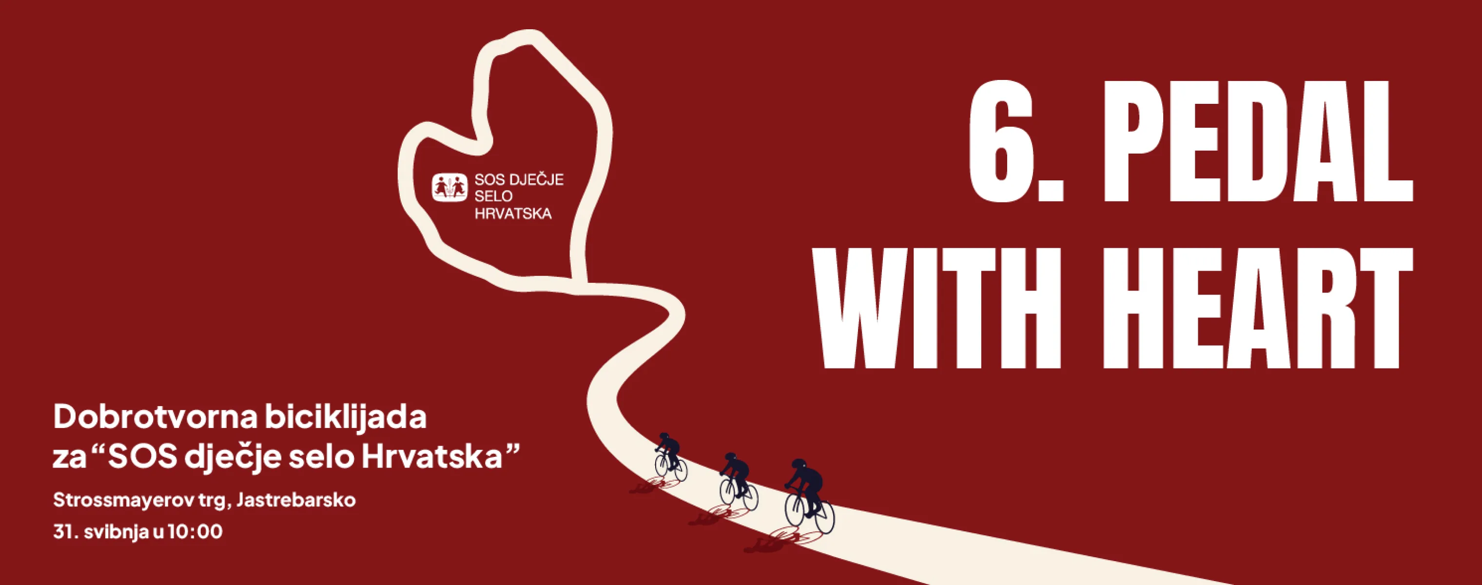
The course the riders take through the countryside around Jastrebarsko, out through the surrounding villages and back, draws a heart by itself. We didn't have to draw it or invent it, only recognise it. That one line became the foundation of the whole identity. The poster is understood at a glance.
The illustration is reduced to three elements: the heart-shaped route, three riders in a line, and a horizon, with nothing else to pull attention away. The SOS Children's Villages logo sits inside the heart itself, so the shape isn't only a symbol but also the place where the partner gets its space.
The colours are just as reduced. Deep red dominates the background and carries the emotional weight. Cream is its counterweight, letting the composition breathe and directing attention to what matters. Navy defines the riders' silhouettes, and their shadows stay in red, so not even a shadow leaves the palette. The type is bold and condensed, which sharpens the graphic clarity further. Anything that would scatter attention was deliberately left out.
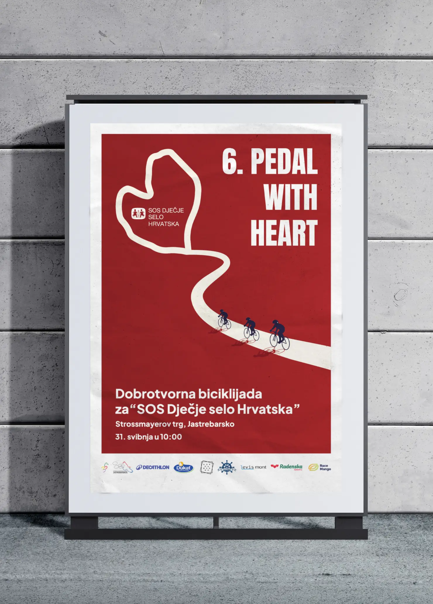
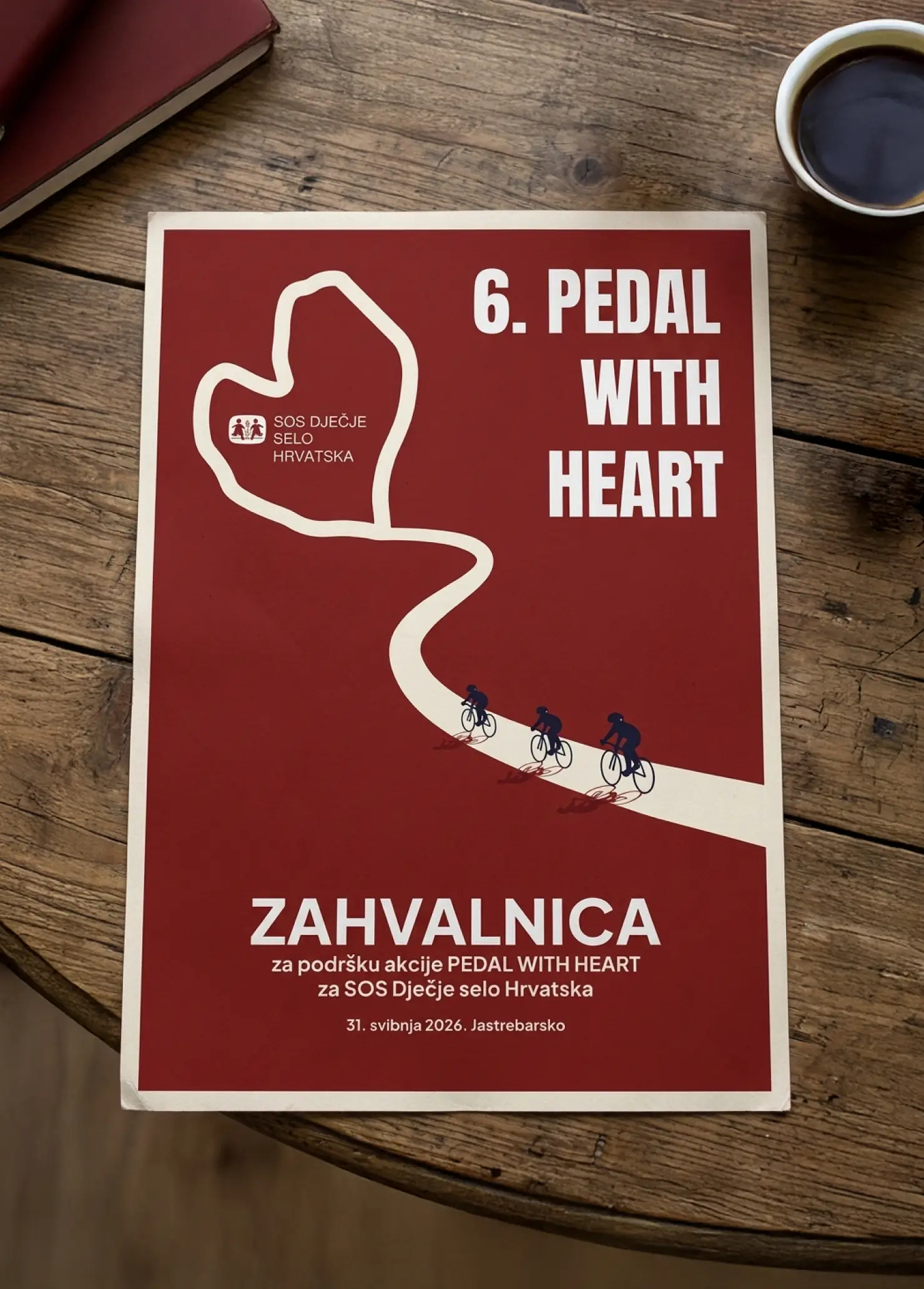
The goal was clear: an identity that's easy to remember and works just as well on a large street poster, a small Instagram post, a certificate, a T-shirt and a medal. Everything shares one shape and one typeface.
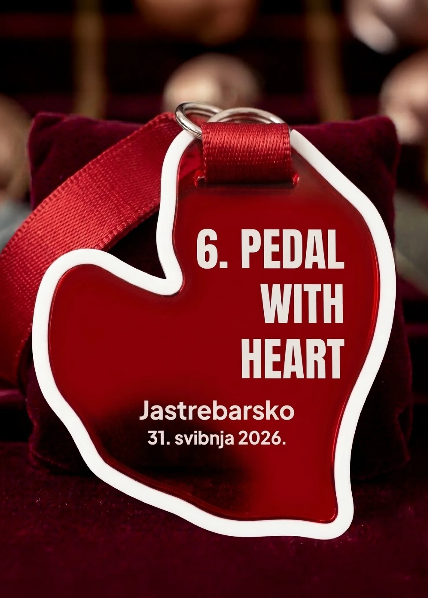
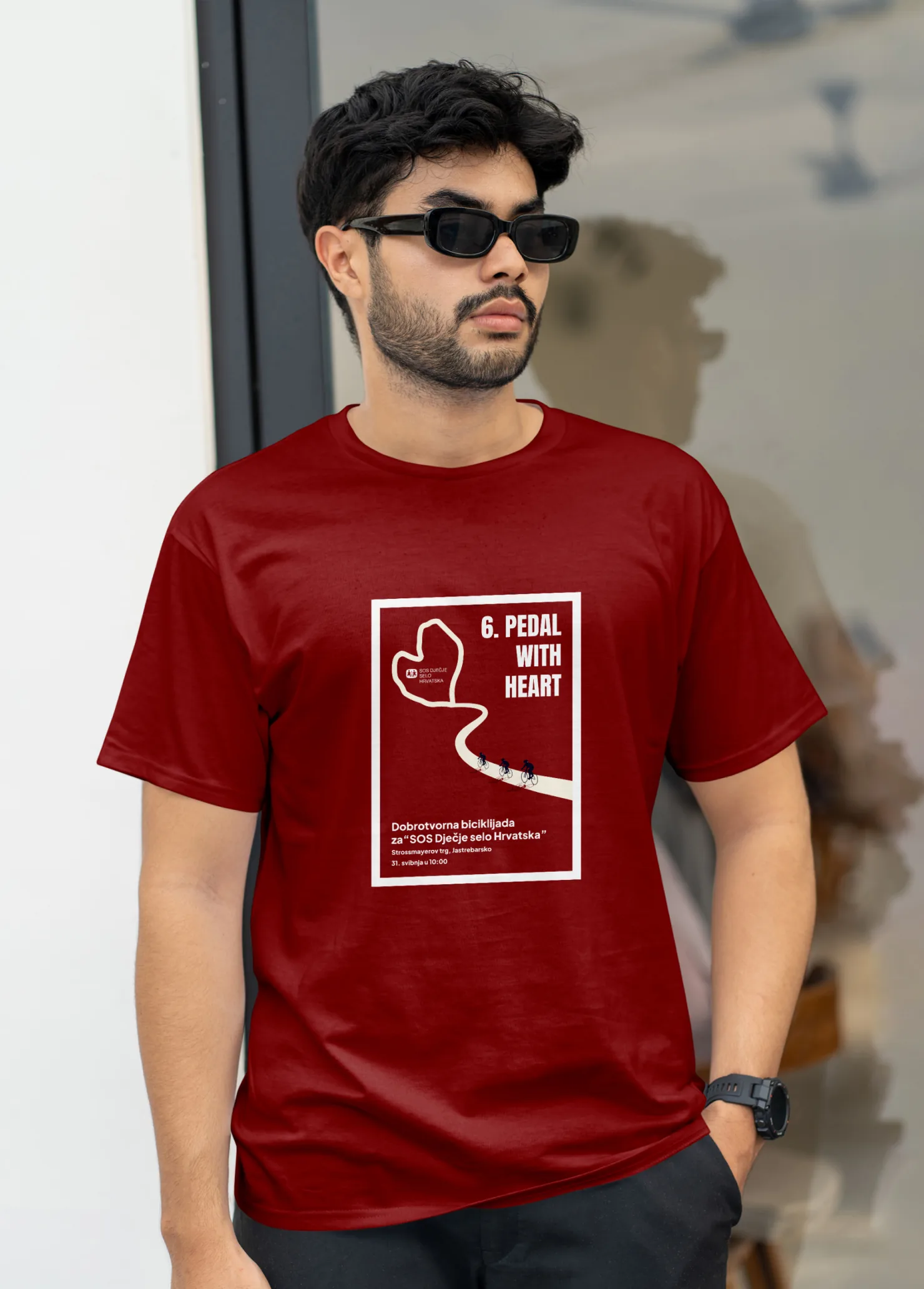
The medal is the most interesting piece. It isn't a round disc with a logo on it, but cut to the shape of the route itself, so a rider takes home the route they've just ridden. The T-shirt design follows the poster, and it's wearable after the event, not only on the day.
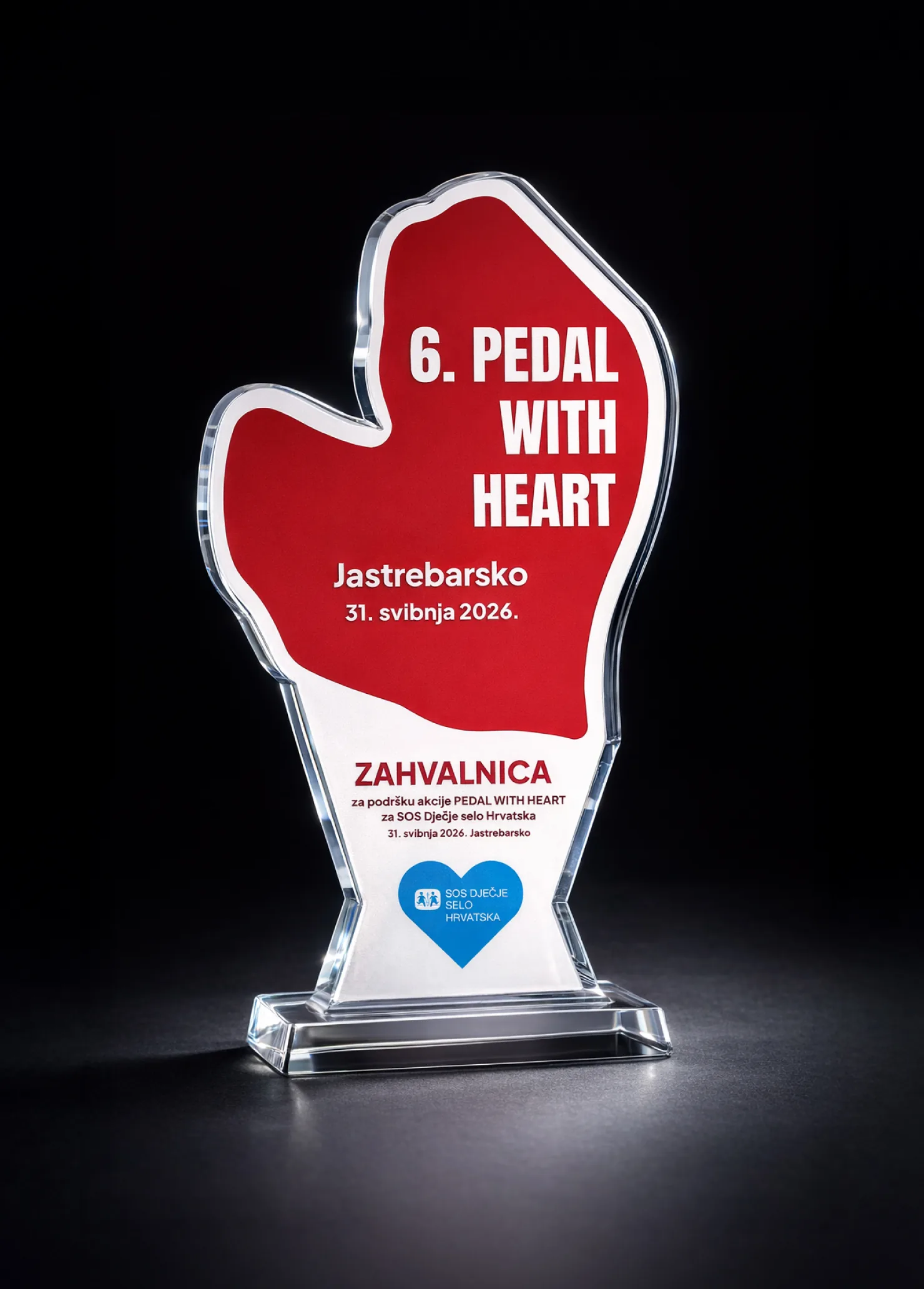
Plaques for partners recognise the contribution of the sponsors who made the event possible. Acrylic, with the outline of the route, serious enough that a partner will put one on a desk or a shelf and show they supported the cause.