Client
TalentQ
Brand, marketing site and product design for a Croatian SaaS platform that scores and ranks job candidates.
TalentQ replaces the first and worst part of hiring. The usual run is CV, interview, decision, and it's the first step that eats the time and produces most of the mistakes. Instead of reading a hundred CVs and guessing, a targeted campaign goes live within 48 hours, applicants answer a questionnaire built for that specific role, and the AI scores and ranks them against it in seconds. Seven to ten days later, five names are ready for interview.
Everyone answers the same questions and is measured against the same key, so whoever ends up at the top got there for reasons that can be pointed at.
The audience runs from a company hiring once a year to one posting a vacancy every month, and from owners and small teams to HR departments and boards, across every industry. Those users share almost nothing except that none of them wants to learn a new system, so everything had to be understandable without instructions.
HR software tends to land in one of two places. Either corporate, which means grey, blue and cold, or startup-playful, which means gradients, illustrations and a tone no board will take seriously.
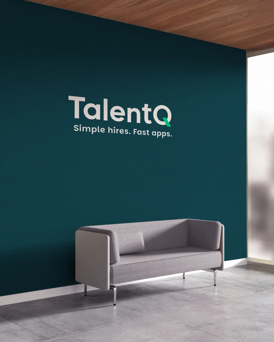
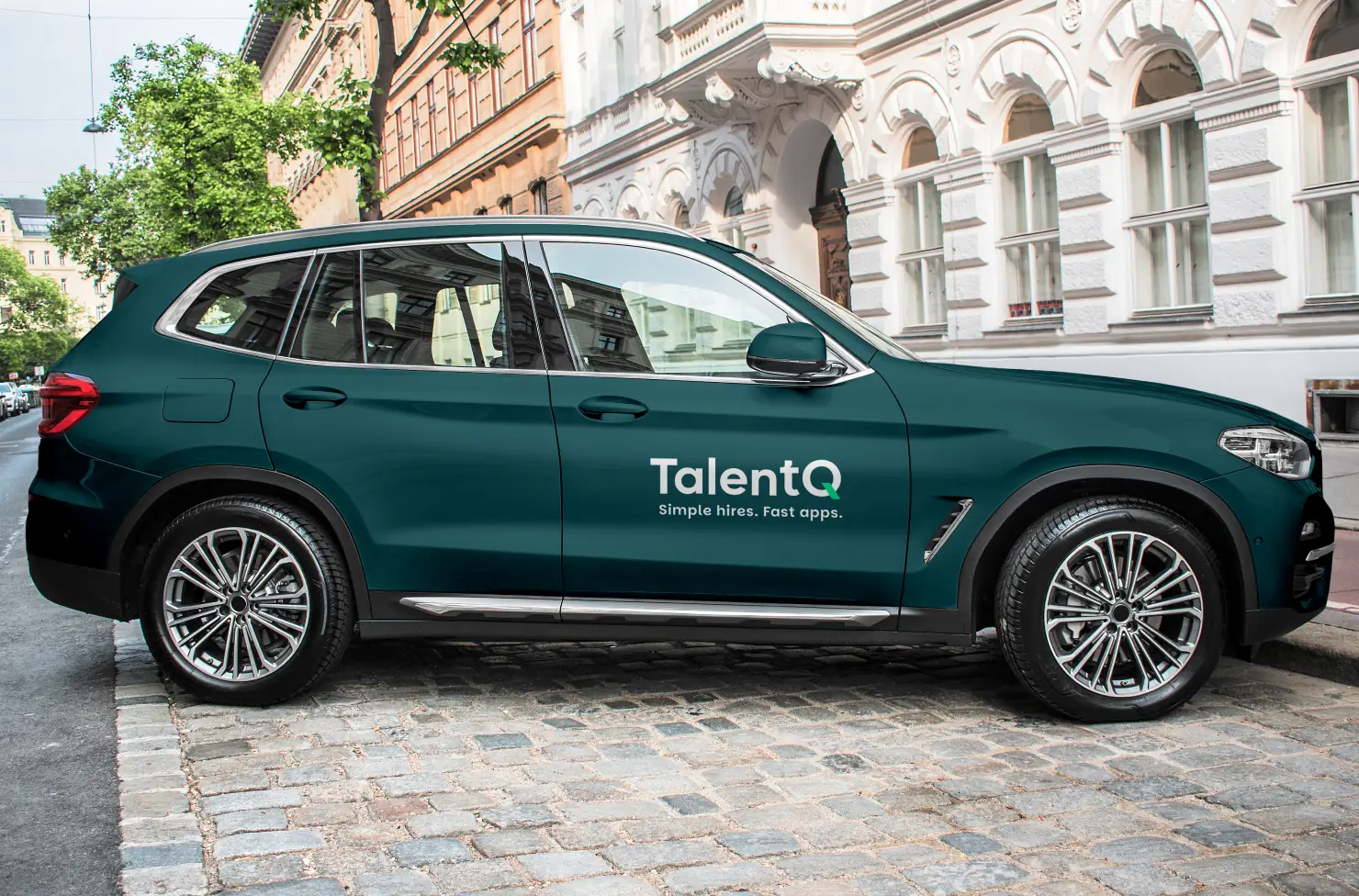
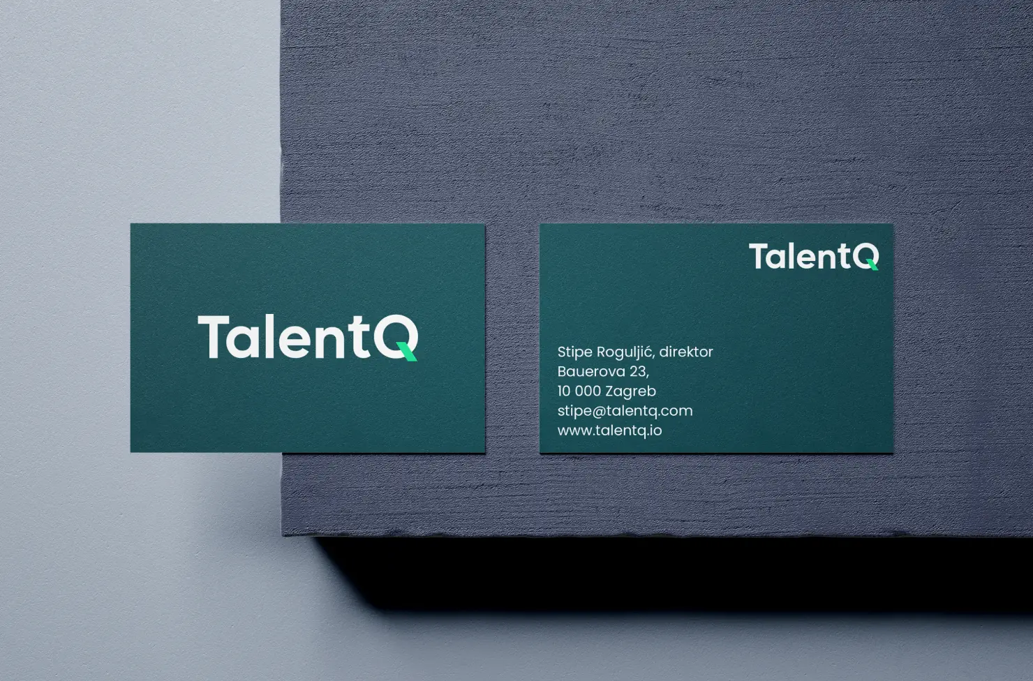
The TalentQ visual identity claims the space between: a wordmark, dark backgrounds, white type, and one signature accent in bright green. Restricting it to a single accent keeps the whole system readable at a glance, which matters most inside the platform, where a green mark has to mean something specific.
That accent sits on the tail of the Q, and the letter earns it. Talent on its own is filler, the sort of word that turns up in every other company name in the sector; the Q is what makes it a brand. It stands for the questionnaire and the quiz, the mechanism the entire product runs on, so anyone who wonders what it means gets the product as the answer. That makes the detail a hook rather than an ornament. It also detaches, so the Q works alone as a symbol wherever the full wordmark won't fit.
Simple hires. Fast apps.
We wrote the tagline the same way the mark was built. Two words for the employer, two for the candidate, because the product has two users who want opposite things: one wants less work, the other wants to be done in two minutes. Four words holding both, which is the job of a line that sits under a logo.
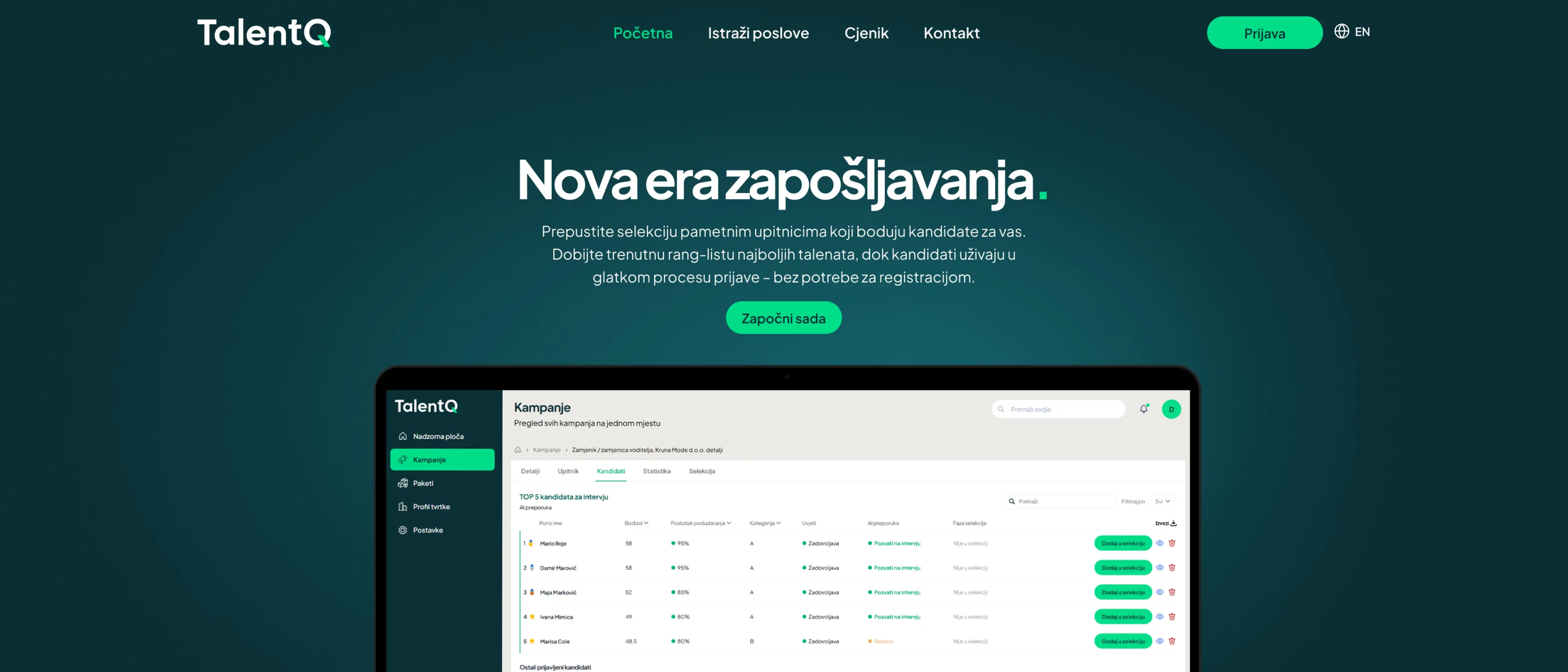
The design carries an argument the copy can't make on its own: an employer who trusts the interface trusts the shortlist that comes out of it. That's why the hero shows the actual dashboard rather than stock photography of people shaking hands. Someone landing on the page sees the product they'd be using, not a mood. Show it rather than describe it, because nobody reads a site the first time, they scan it.
The page then alternates dark and light sections, which does two things at once. It keeps the eye moving from one section to the next instead of sliding down a uniform page, and the two registers carry different things: the dark sections read as technology, the light ones as clarity and administration. A hiring platform needs both.
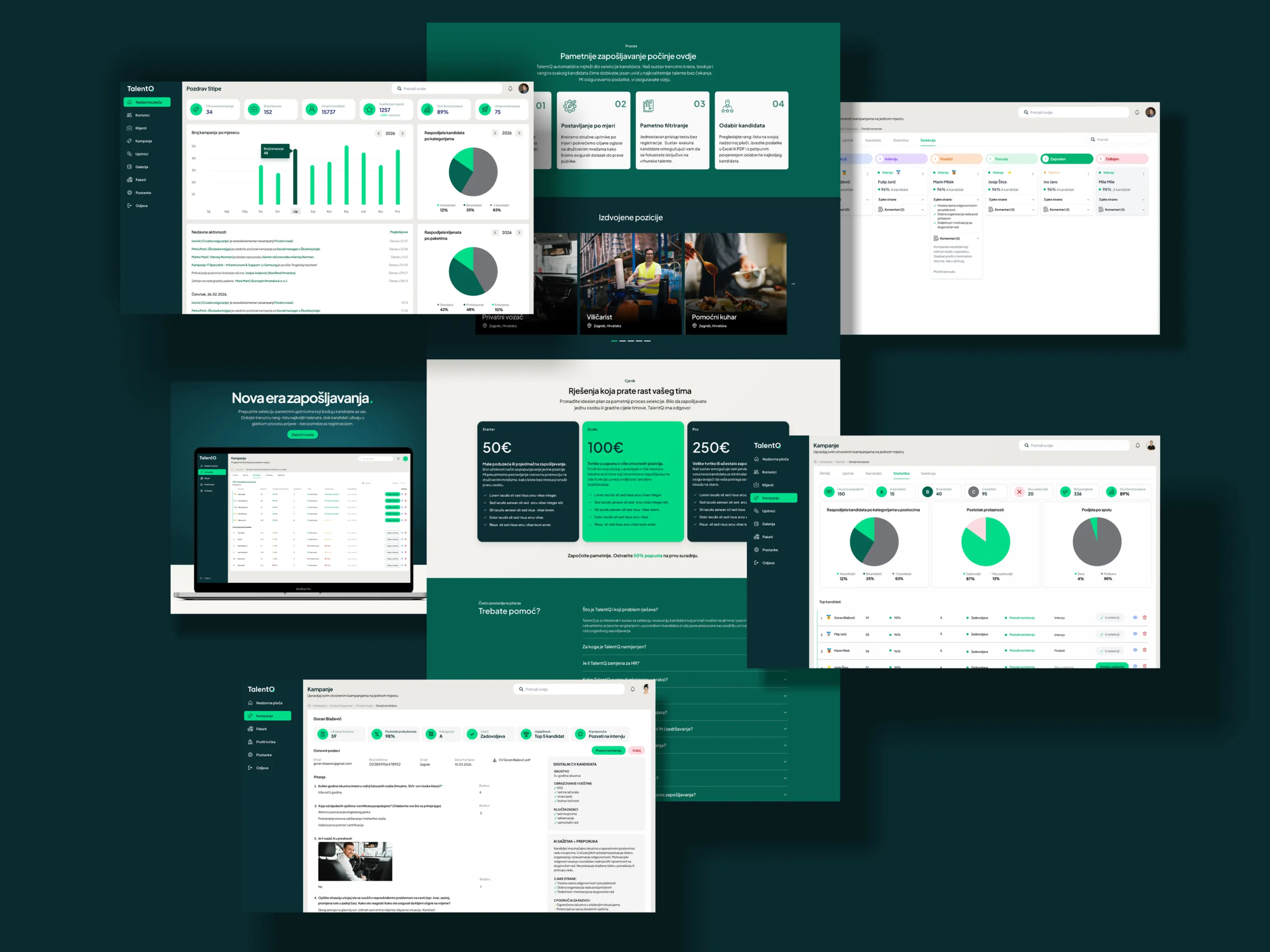
The site is the first touch. The product is what comes after, and it's where the actual work happens: the dashboard, the pipeline, the per-candidate reports and the candidate's side of the process. It has to make sense the first time, because nobody is going to sit through a tutorial to review candidates.
The hardest part was the ABC classification. Scoring can be technically sound and still useless, because if you can't see why one person came out an A and another a C, you go back to reading CVs and the platform has changed nothing. So every candidate arrives readable at several depths: a match percentage and a category at a glance, enough to decide who to open first; a short digital CV the system builds from the questionnaire answers, so there's something to actually read; and underneath, the AI summary and the reasoning behind the score, for whoever has to defend the choice to a board.
On the candidate's side the decision was to ask for nothing up front. No account, no password, no CV. Two minutes and it's done. The number of applicants is what the client is actually paying for, so every extra field between a candidate and the first question costs the client applications.