Client
Zeleno srce
A website for a luxury wellness retreat in the forests of Gorski Kotar — live and climbing in search long before the first guest.
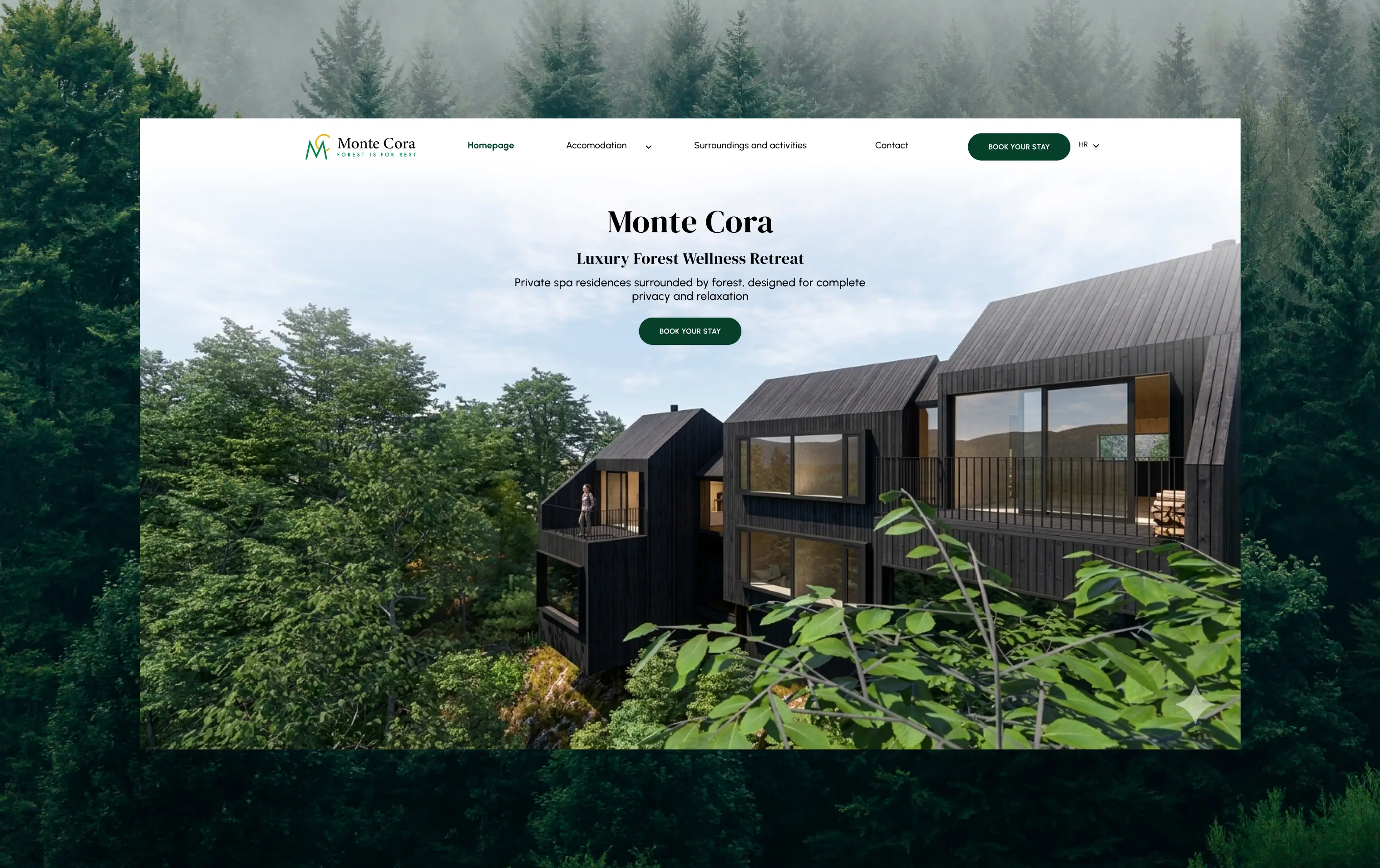
Monte Cora is a carefully imagined forest retreat in Fužine — top-tier design, complete privacy and the untouched nature of Gorski Kotar, all within reach of the sea.
When the project reached us there was a simple website that didn't do it justice, and construction hadn't even started. The client wanted a digital presence long before the first guest: a site that would follow the progress of the build and grow its search ranking in the meantime.
Instead of patching up the existing website, we built a new one from scratch — from the name and tone of voice down to the last pixel. The old domain was redirected in full, the sitemap submitted to Google Search Console, and indexing requested for every main page. Construction is underway today, and the site has been live for months, climbing in search results before the first guest even arrives.
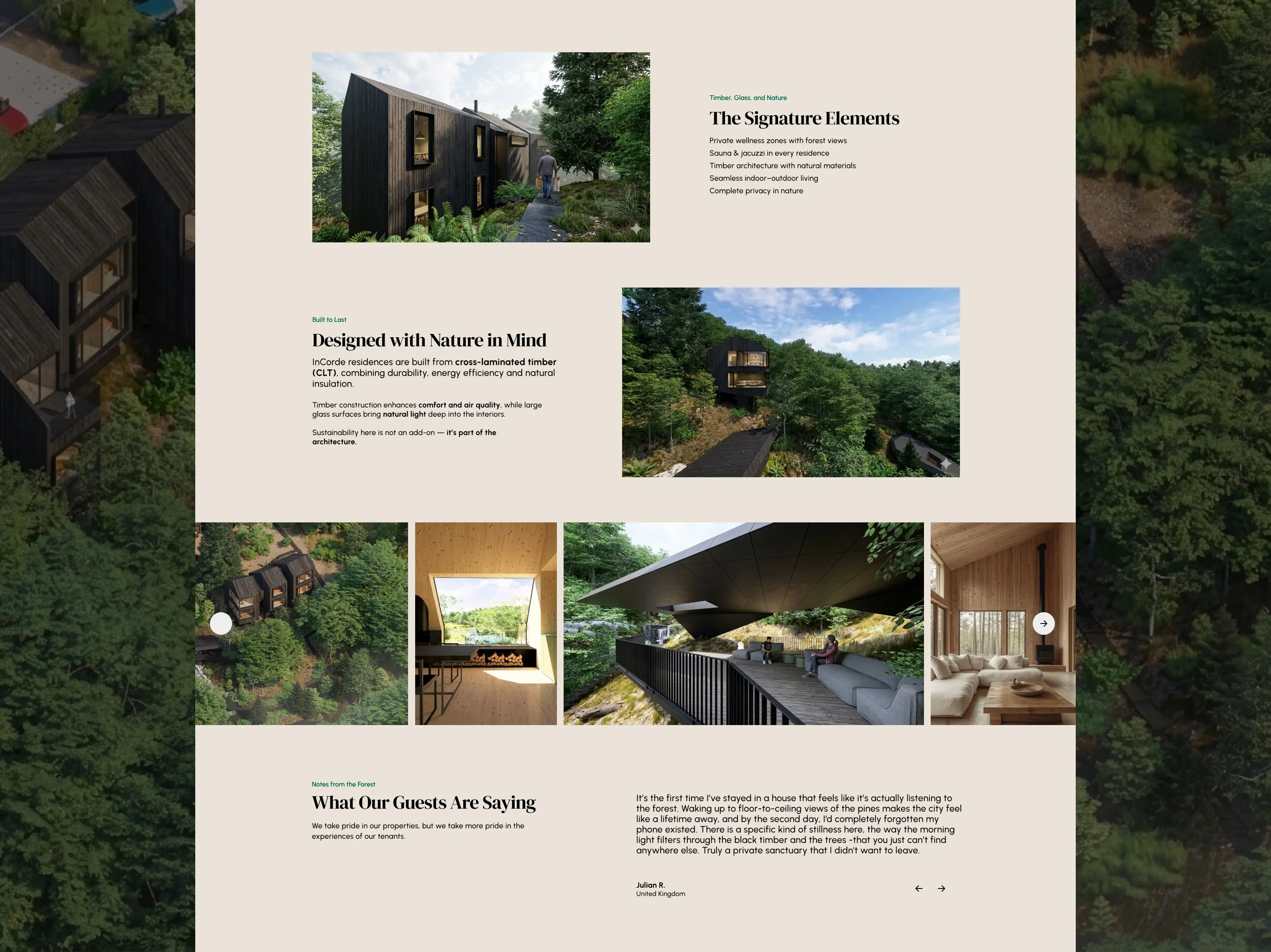
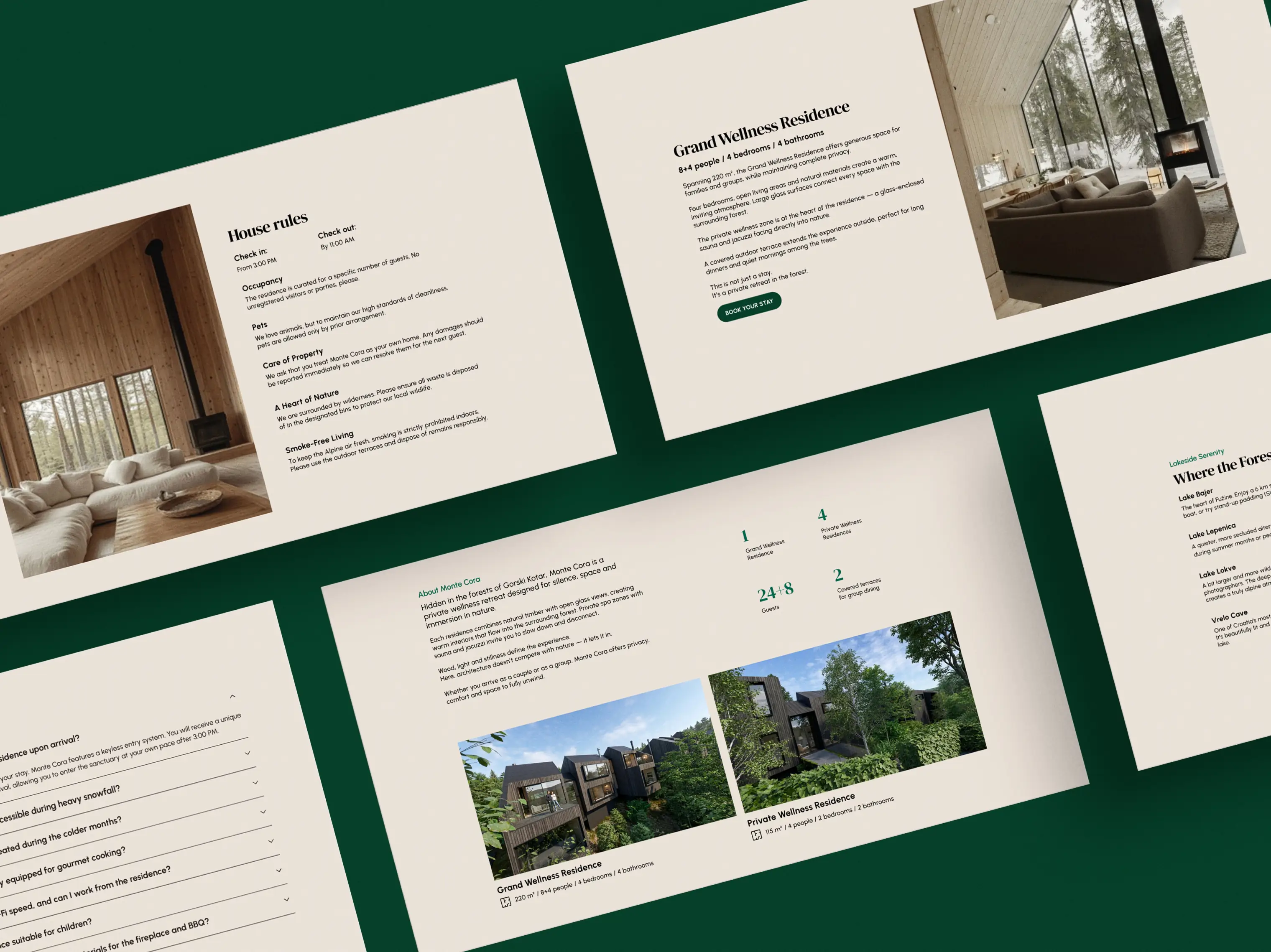
With the build still underway, all we had to work with were renders — dark and strictly technical. There was no way to picture a Saturday morning on the terrace in them, and since real photographs of the finished space don't exist yet, those early renders had to do all the work and convince a guest this place is worth the trip. So we took them into our own hands: we softened the light so it wouldn't feel sterile, warmed up the tones and furnished the empty rooms with details that bring them to life. Instead of a cold 3D model, you now see at a glance a space where real people stay, rest and enjoy the quiet. That work of reviving the space is where the entire palette of the site came from: the tones of natural wood from the interiors and the deep, calming green of the forest stretching beyond every window through the vast panes of glass.
We carried that same calm into the interaction itself. The site doesn't open abruptly or loudly; the animations are measured, fluid and slow, just enough to follow the rhythm of the forest. Every transition glides without effort, echoing the feeling of stepping into a place where rushing isn't allowed, so the digital experience starts preparing the guest for Gorski Kotar from the very first click.
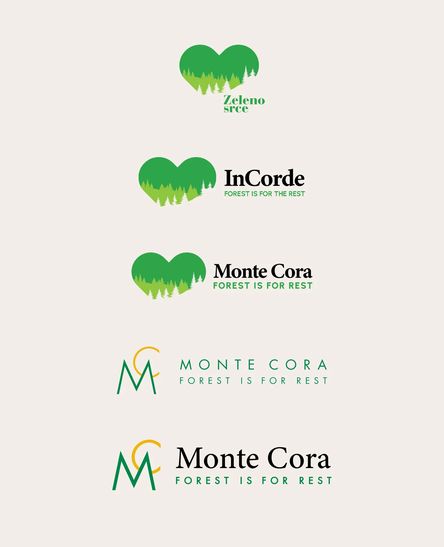
Every serious project goes through its own process of maturing, and Monte Cora's visual identity is the clearest proof of an idea being refined step by step. The story began as Zeleno srce, grew into In Corde and finally settled as Monte Cora, with every stage carrying the same recognisable heart filled with forest and an elegant serif typeface.
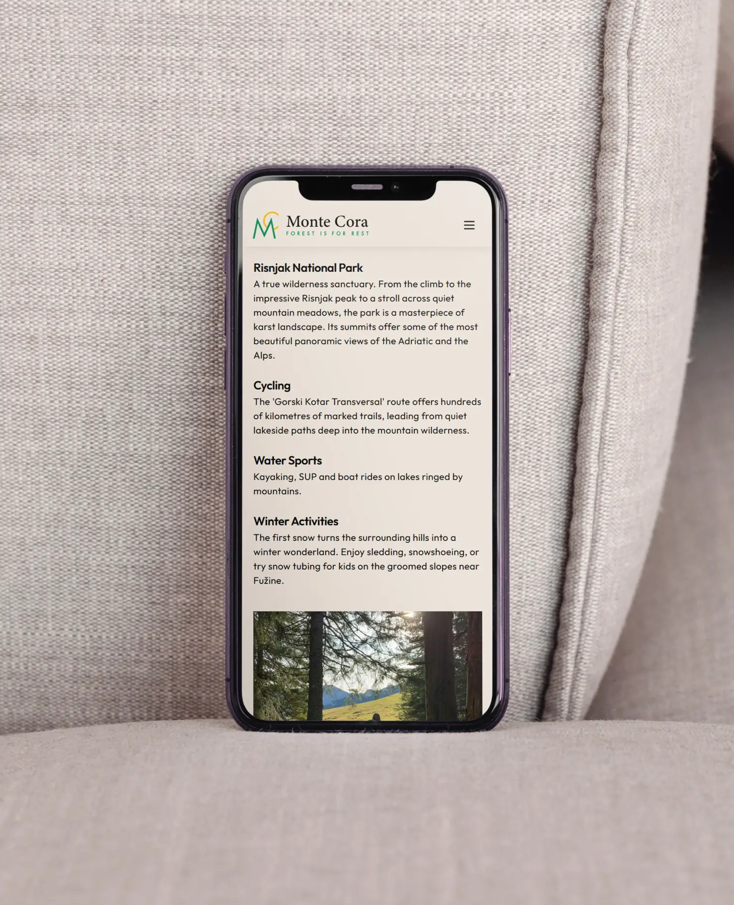
The final change to the identity came after the site had launched. The monogram of the initials M and C brought clarity and a modern edge, but also a sharpness and reserve that sat at odds with the visual language of the website. At the client's request and with the permission of the logo's author, we softened it and closed the circle by introducing the serif wordmark Monte Cora. Its refined typography gave the brand the elegance and warmth it needed, connecting a modern digital form with the deep, calming character of Gorski Kotar at first glance.