Van Houten
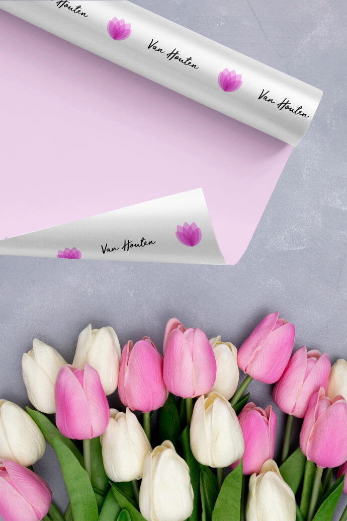
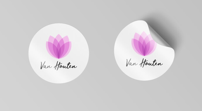
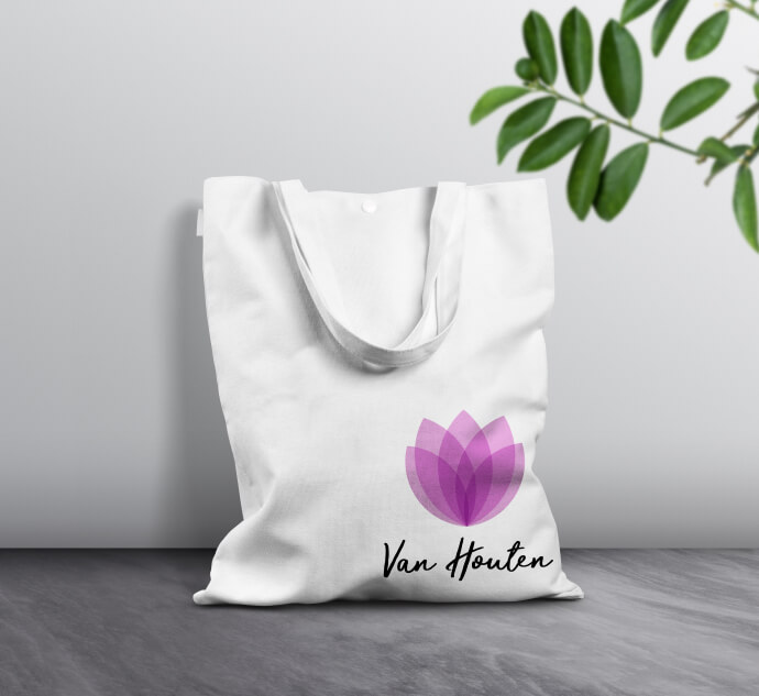
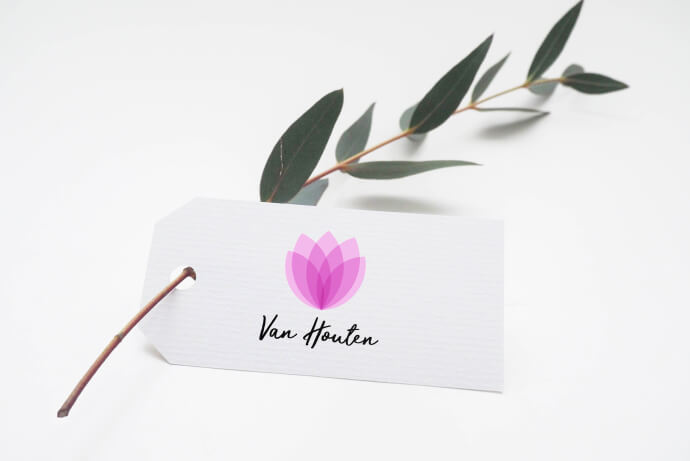
Van Houten is one of my favourite personal projects. While playing with layers and opacity in Illustrator, I came up with the idea of a flower shop. It started with a logo, but it became a branding project. The logo is a combination of a tulip with delicate pink layered petals and an elegant, but modern handwritten font. The best-known meaning of tulips is the perfect and deep love. As tulips are a classic flower that has been loved by many for centuries, they have been associated with the meaning of love. They are the perfect gift to give someone you love deeply and unconditionally, be it your partner, children, parents or siblings.
Client: personal project
Services: branding
Year: 2020