Client
Verde, roastery and café
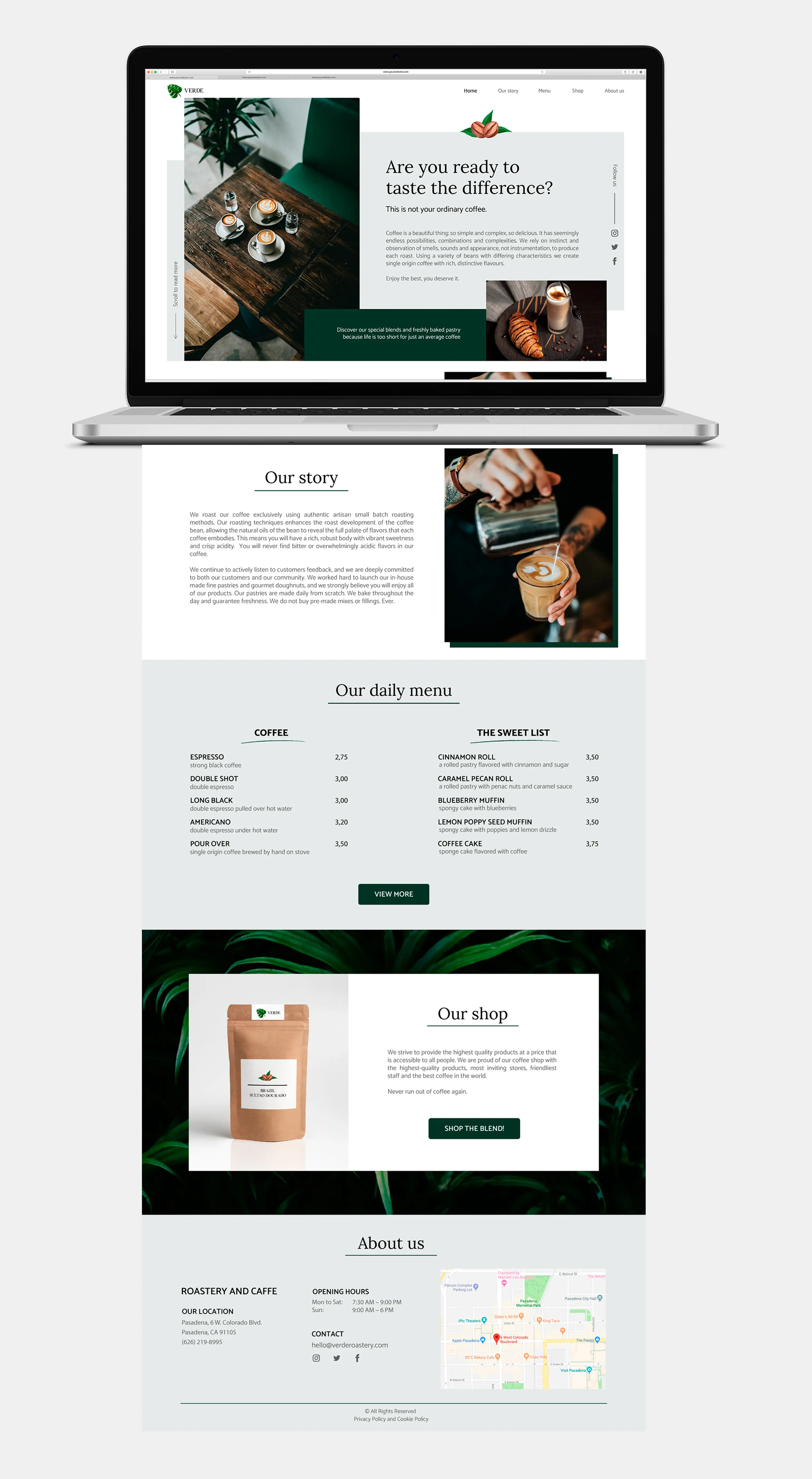
Brand identity and website design for a coffee roastery with its own café — from the deep green palette down to the printed menu.
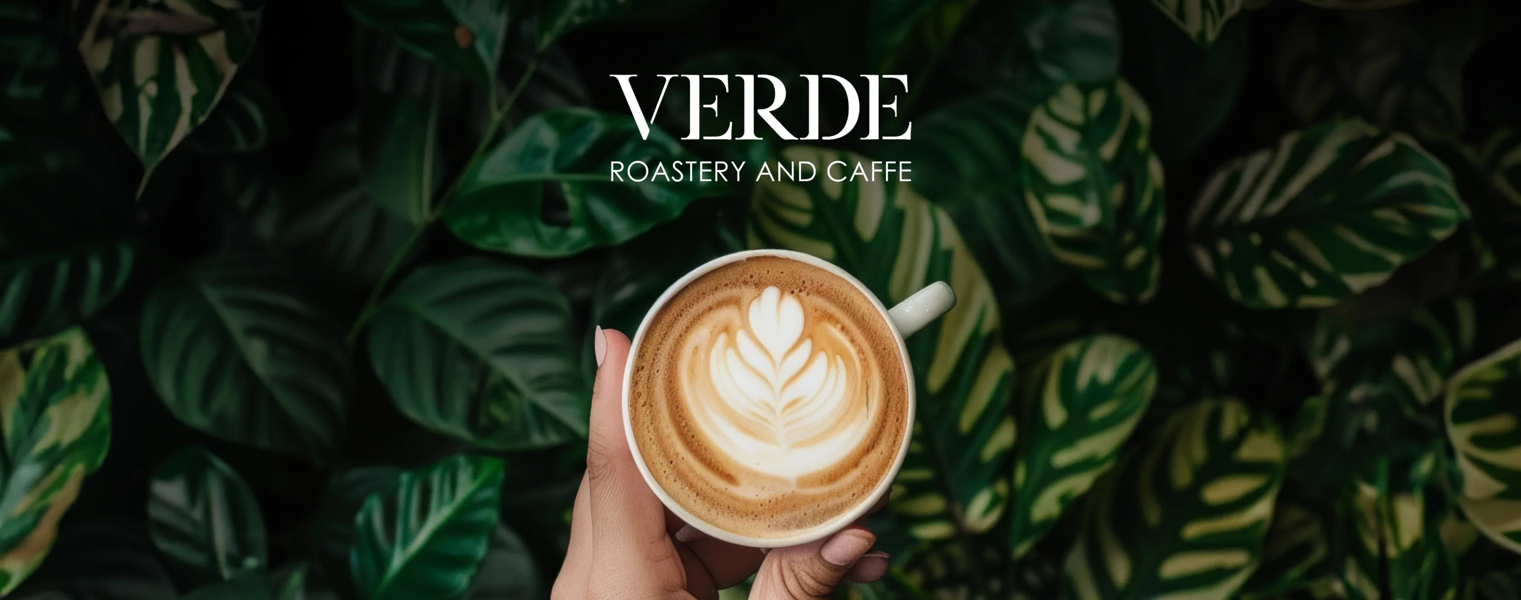
Verde means green, so the direction was settled before the work began. The only question was which green. We went deep rather than bright: forest tones that read as calm and grown-up instead of fresh and loud.
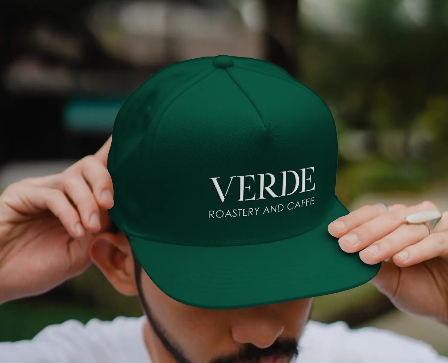
The wordmark is set in a high-contrast serif, thick stems against fine hairlines, with "roastery and caffe" below it in light, widely spaced capitals. The name arrives first and the description follows quietly.
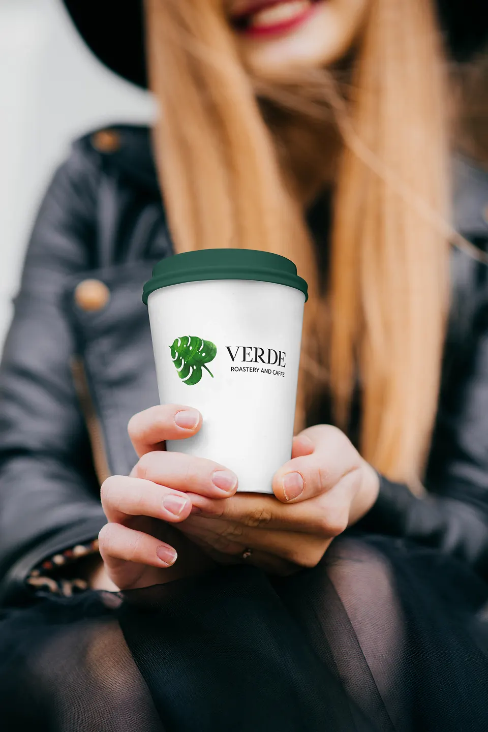
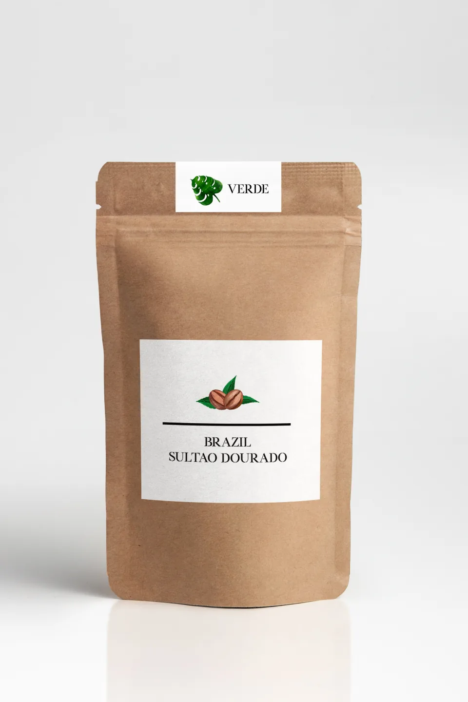
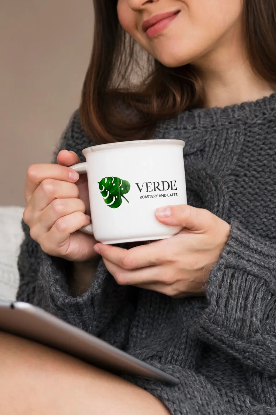
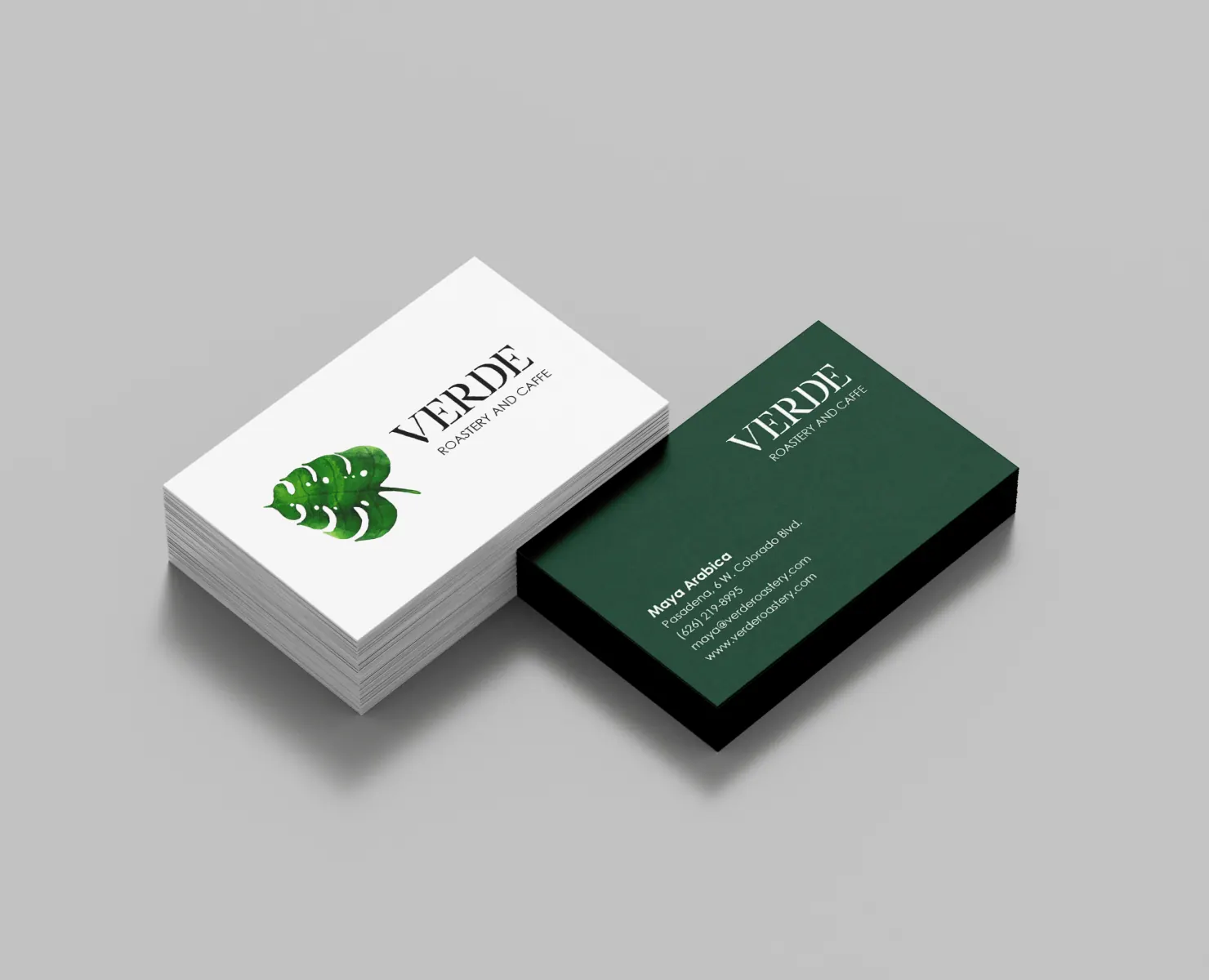
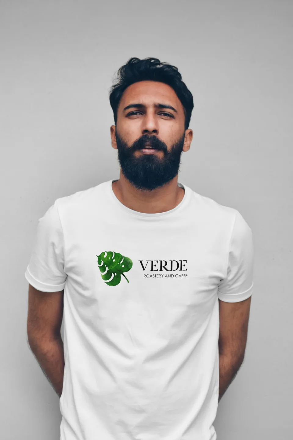
The identity was carried across what a customer holds or walks past: takeaway cups and mugs, kraft coffee bags with origin labels, paper and tote bags, business cards, an embroidered cap, staff t-shirts, window signage, the printed menu and a framed poster for the wall.
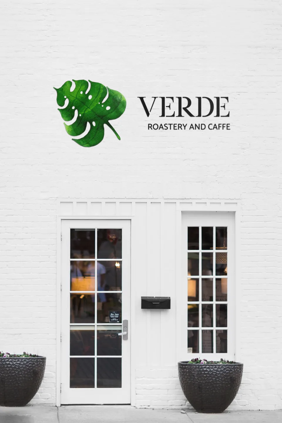
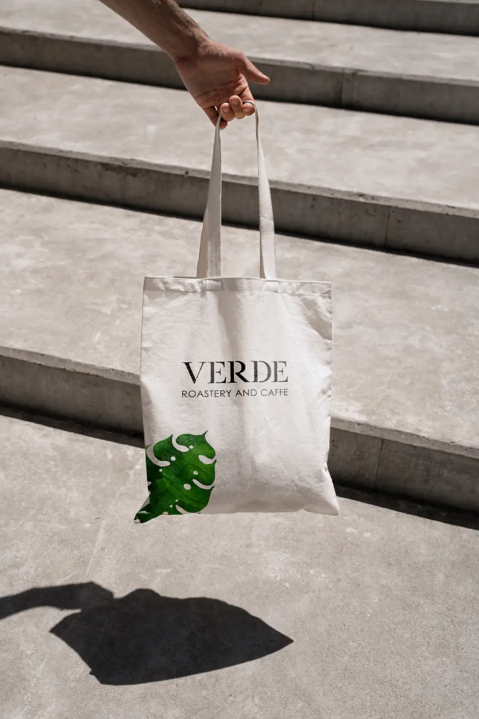
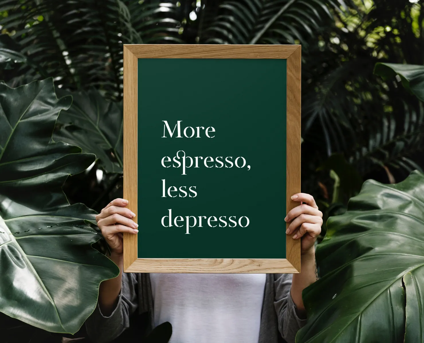
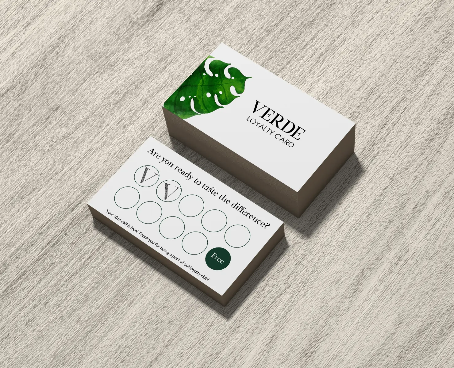
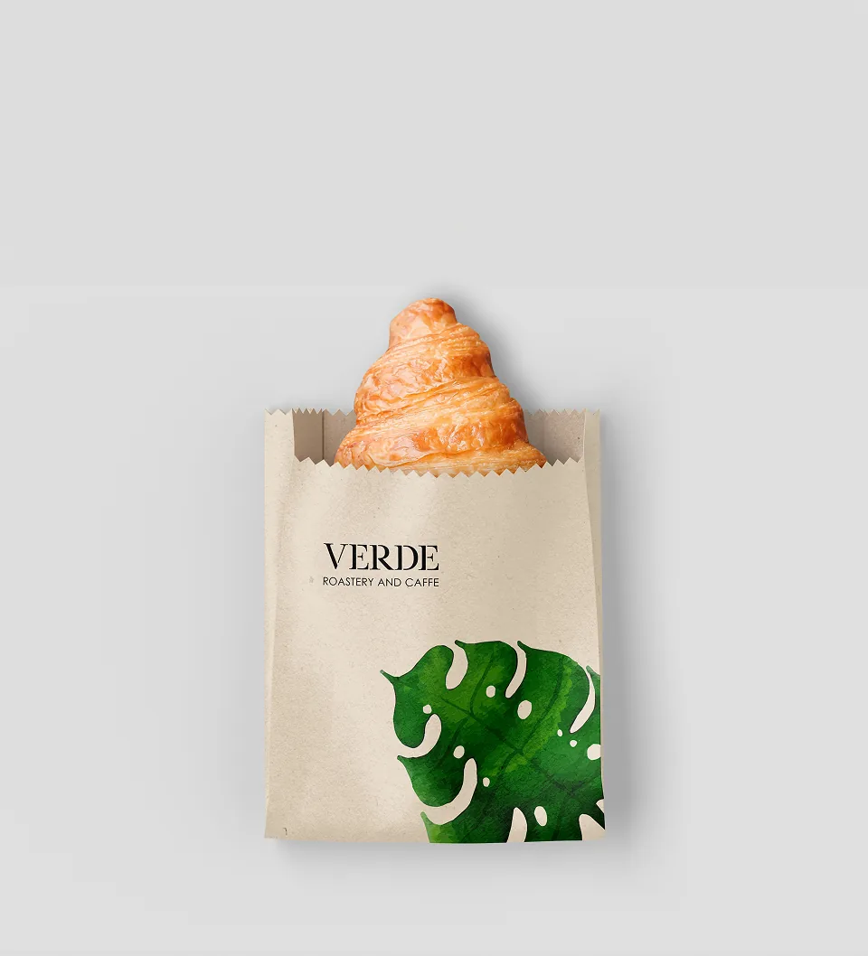
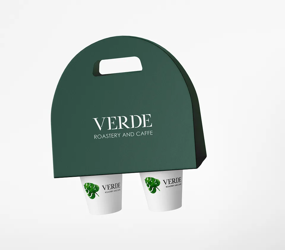
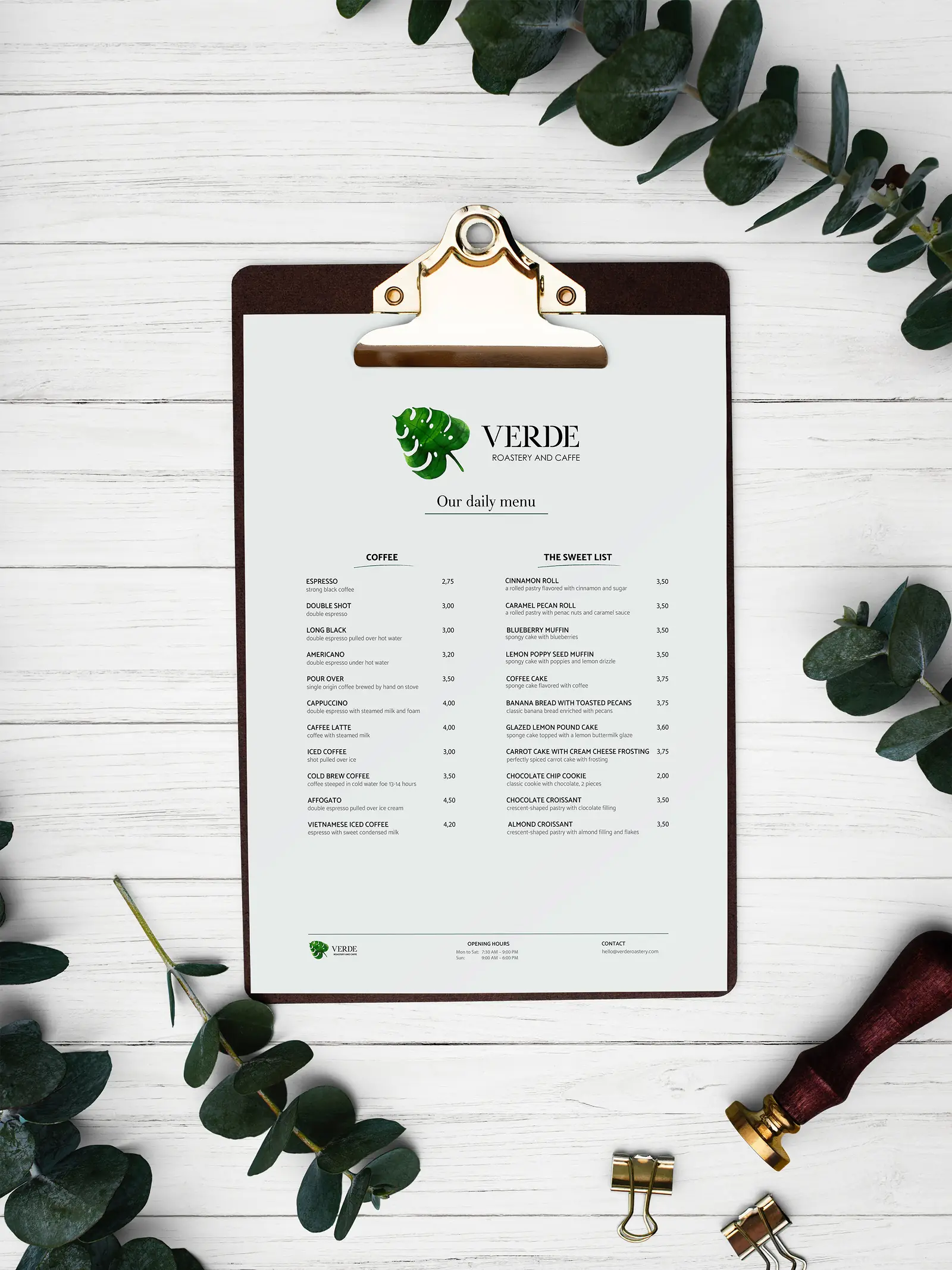
The project covered the full scope, from logo and brand identity to a complete website design with an integrated online store that could serve two very different purposes at once: make someone want to visit the café on a Saturday afternoon and try the coffee and something from the dessert menu, and make someone else want to order a bag of beans to their doorstep on a Tuesday night.
The brand had to say three things at once: eco-conscious values for customers who care about them, a premium, crafted quality, and a warm, welcoming atmosphere that says "come in, sit down, stay a while." The challenge was doing all three without the brand feeling corporate, cold, or preachy about sustainability.
Verde closed during the pandemic. This case study shows the identity and website as designed.