Client
Prozorčić speech and language therapy
Visual and educational materials for a speech and language therapy practice — where a poster on the wall and an illustration on the table are working tools, not waiting-room decoration.
Prozorčić is a speech and language therapy practice working individually with children on speech development, language skills and communication abilities. Through a warm, supportive and professional approach, it helps children overcome speech and learning difficulties and build confidence in communication.
We collaborate on projects for children and parents, designing visual and educational materials. Some are created to support communication and learning, while others are simply designed for fun and play. That means the material isn’t only decorative: a poster on the wall and an illustration on the table are working tools, not just something to fill a waiting room.
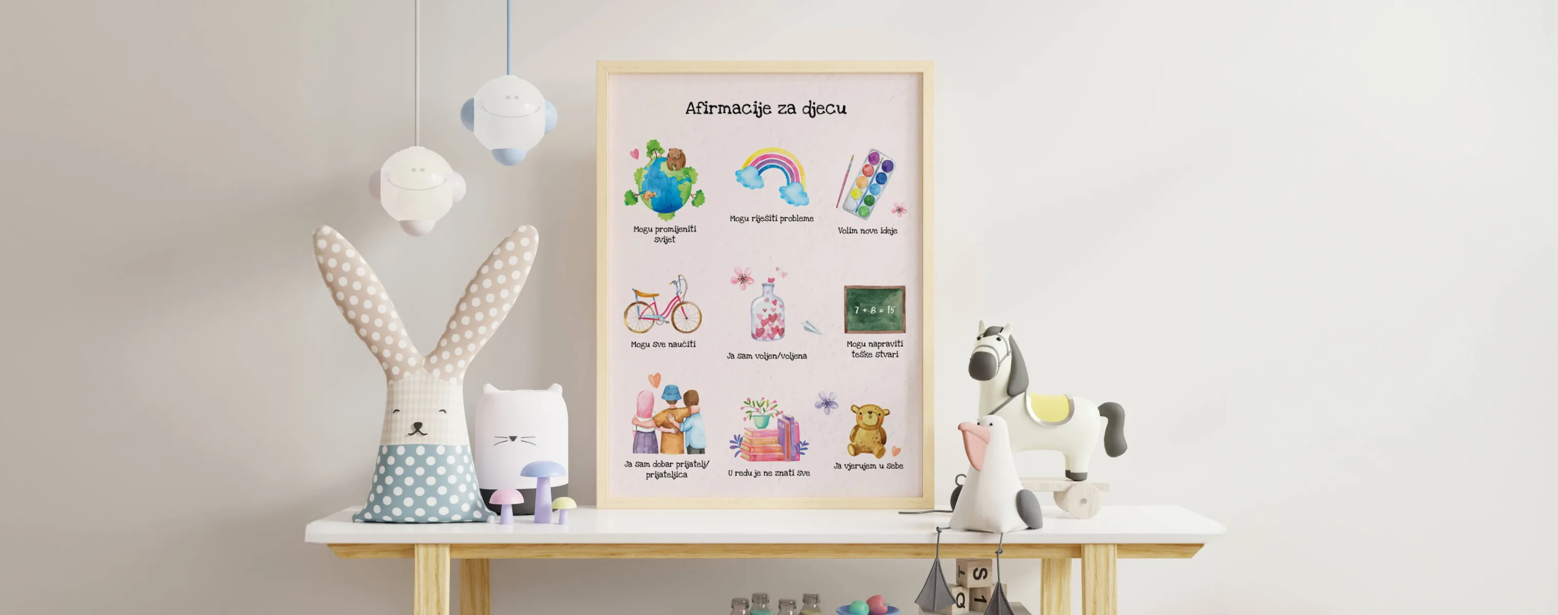
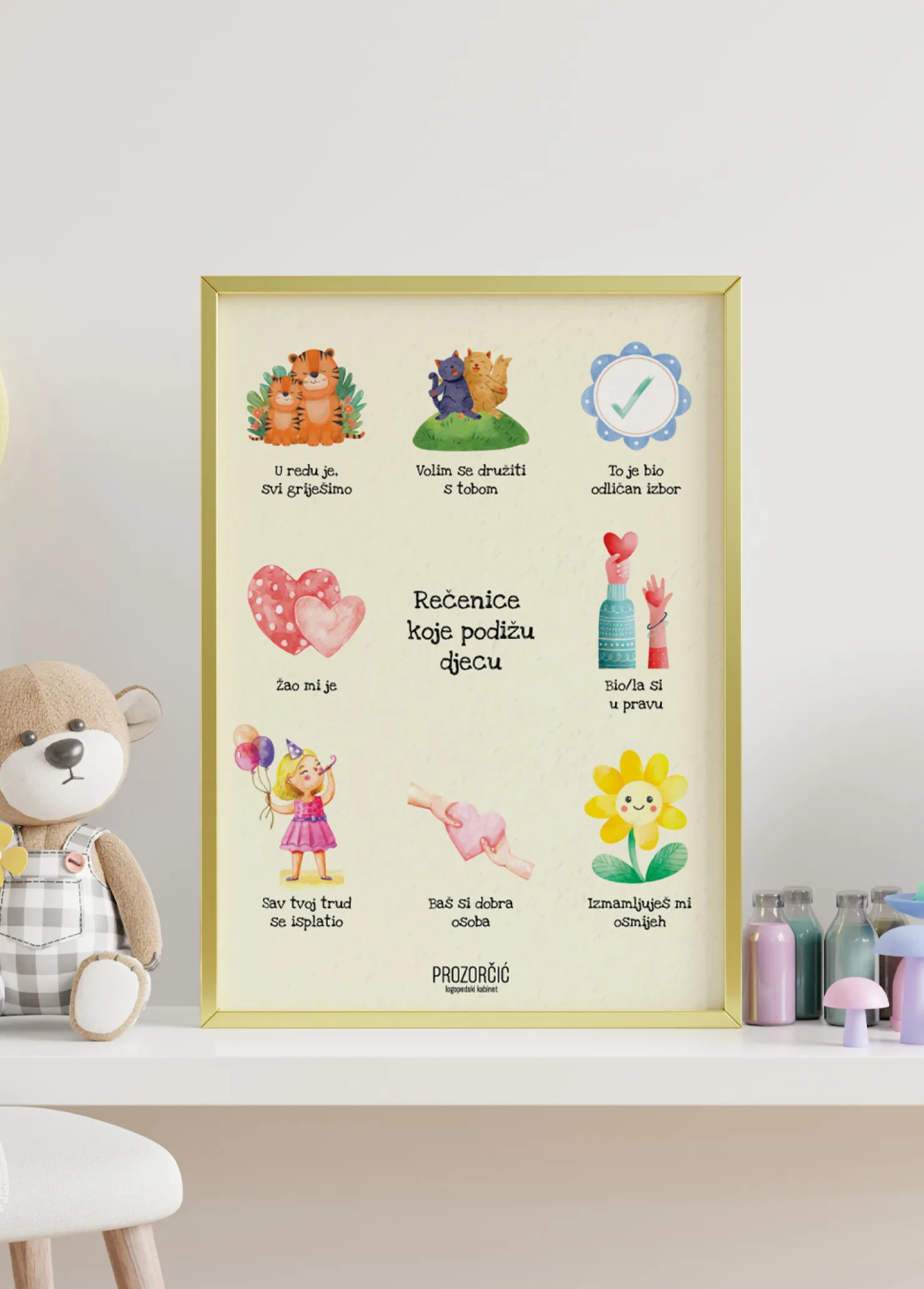
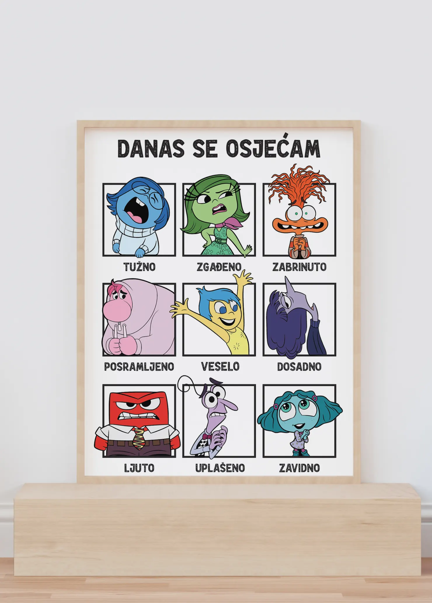
The poster series covers what comes up in the practice anyway: affirmations for children, sentences adults can use to support a child, and a grid of emotions a child can point at to show how they feel.
The last one is the most useful, because it solves a real problem in the room. A child who can’t name what they’re feeling can point instead, and the conversation starts there. The sentence poster, on the other hand, isn’t for the child at all but for the parent waiting in the room, which is the quietest way to give someone advice.
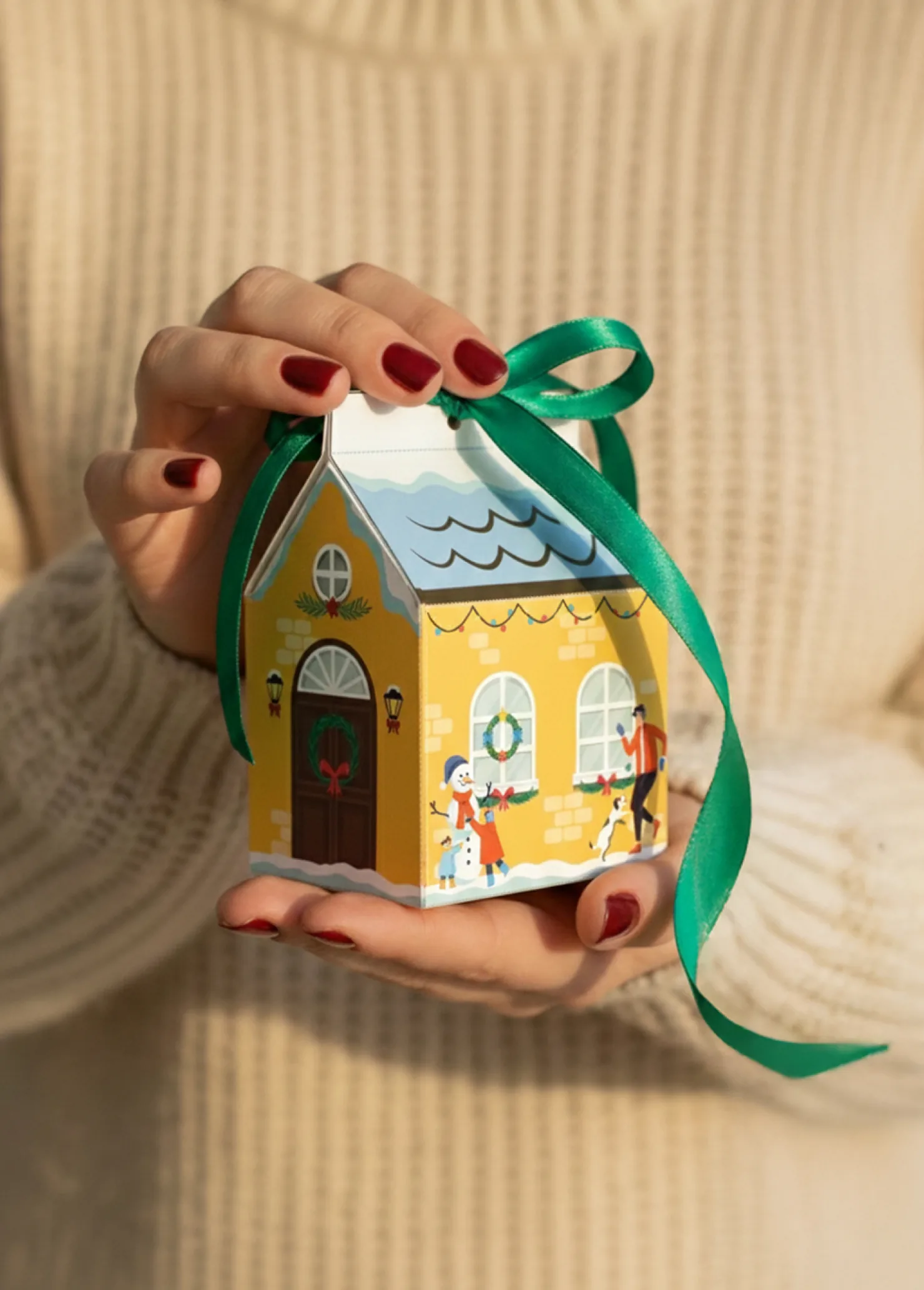
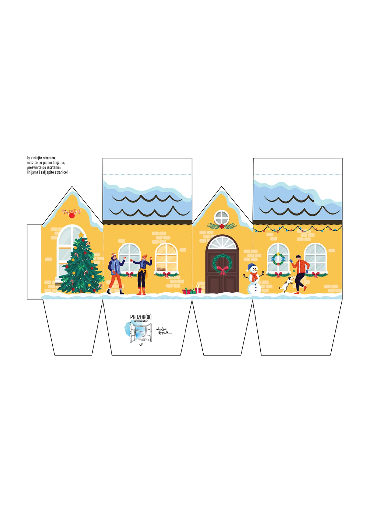
At the end of 2024 we designed a gift box shaped like a house. The client had seen a similar idea on Instagram but wanted her own version, tailored to her clients and matching the colours and identity of the practice. So the house was drawn from scratch, with a yellow façade, a wreath on the door, a snowman and a Christmas tree, and the scene runs across all four sides as a single picture.
It isn’t a finished box but a template to print, with instructions in four steps: print, cut along the solid lines, fold along the dotted ones, glue. That changes what it’s for, since assembling it becomes something a parent and child do together. Technically it meant the scene had to line up across every edge, and the cut and fold lines had to be legible to someone who has never assembled a box before.
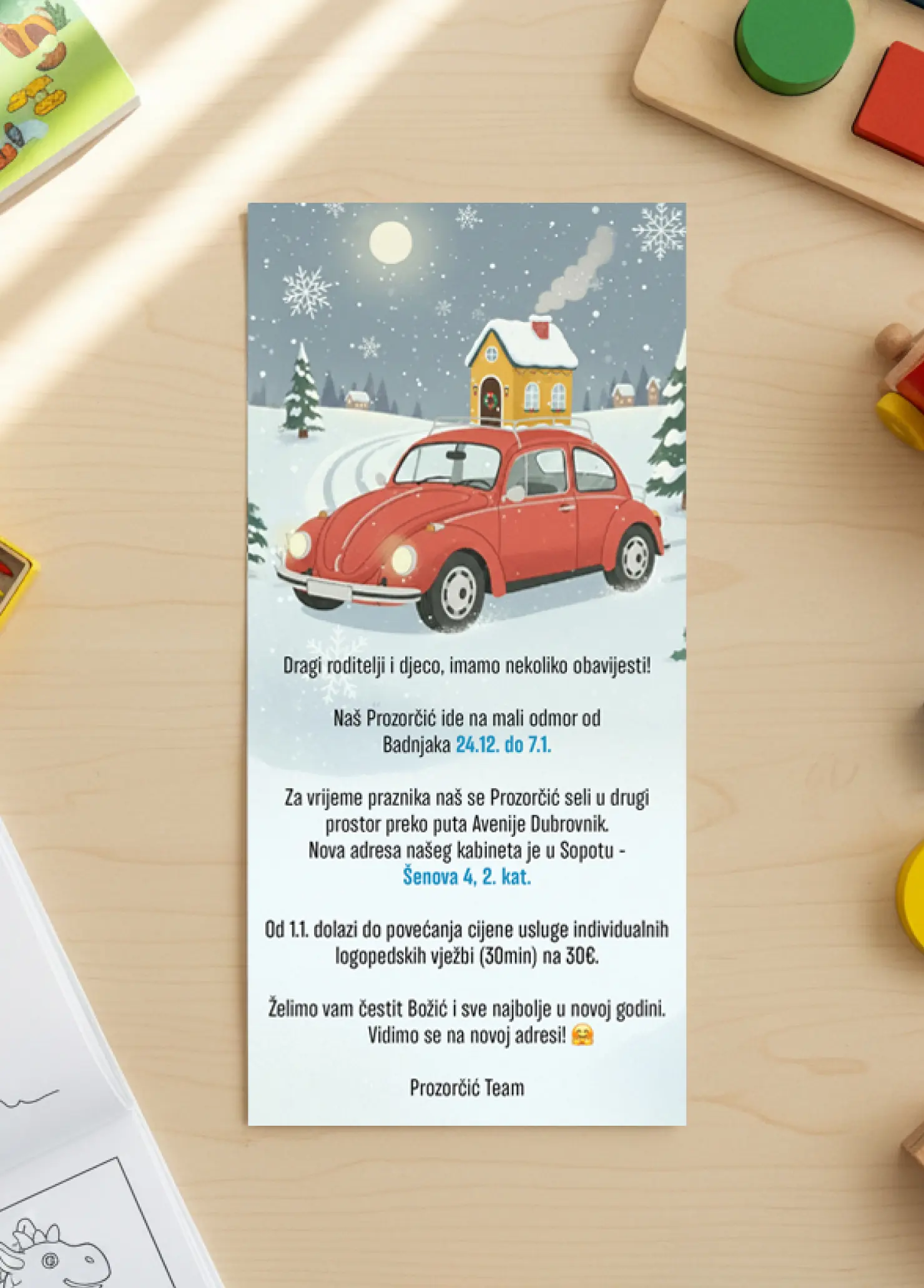
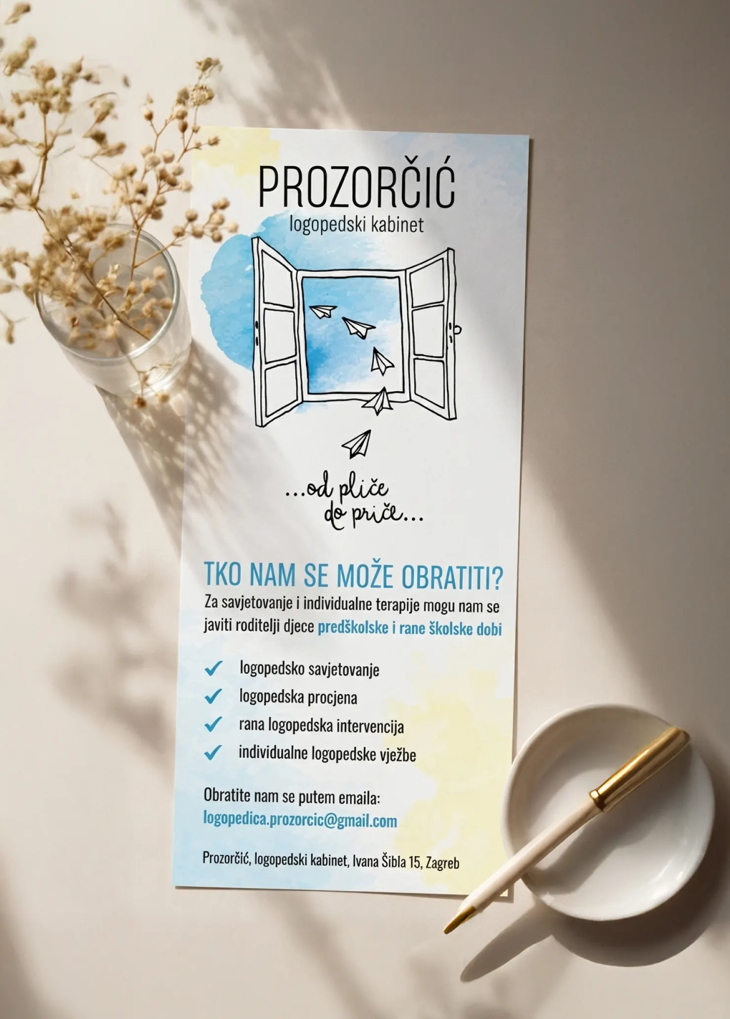
We produce flyers for the practice regularly, from notices about the move and opening hours to presenting services and seasonal offers. Each has its own job and its own tone, but they all stay in the same visual language, and the details that matter — dates, prices and deadlines — are always highlighted so they’re found even when the text is only skimmed.
For the practice’s profile we produce visuals and reels, mostly from material that already exists. An illustration made for use in a session becomes a post, and the emotions poster works as well on a screen as on a wall. Some reels are a small game in themselves: a child and a parent search for something, guess it or recognise it, so the post isn’t watched but played. A parent following that profile often doesn’t yet know whether they need a speech therapist, so every post quietly answers that question too.