Client
Cammeo, with Virtualna tvornica
A website refresh for the Cammeo taxi service: cleaner, faster to use, and built around what a passenger actually needs.
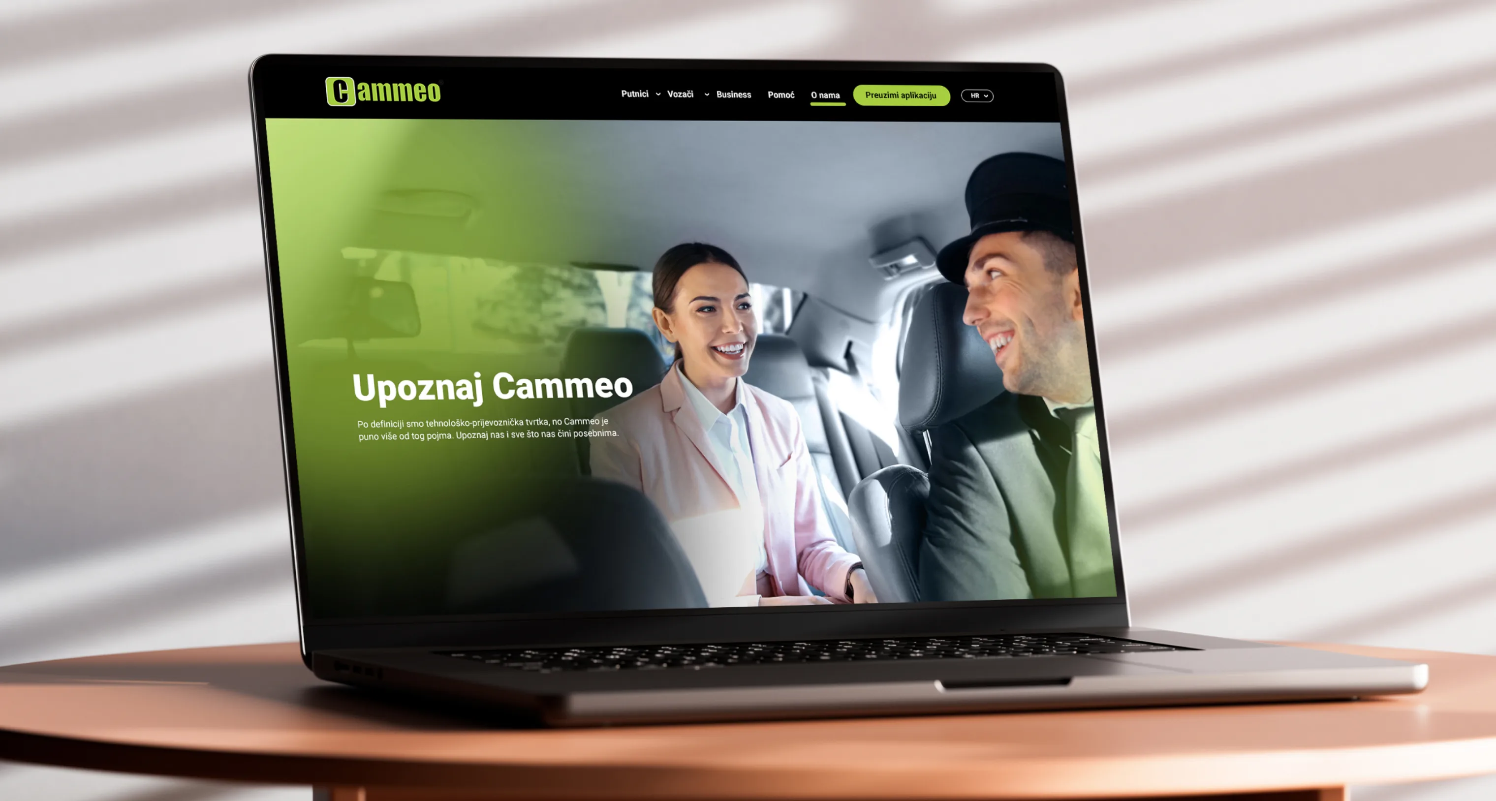
Cammeo was one of the best-known taxi services in Croatia, operating in every major city. Its website was outdated, visually and in terms of user experience, at a time when younger customers were choosing Uber over traditional taxi services and arriving with expectations set by an app.
In 2023 the company was preparing for a major change of identity, the one it would emerge from as Wizi. Before the rebrand began, the site needed sorting out: modernised, simpler to use, and built so it could adapt to the new identity later without difficulty.
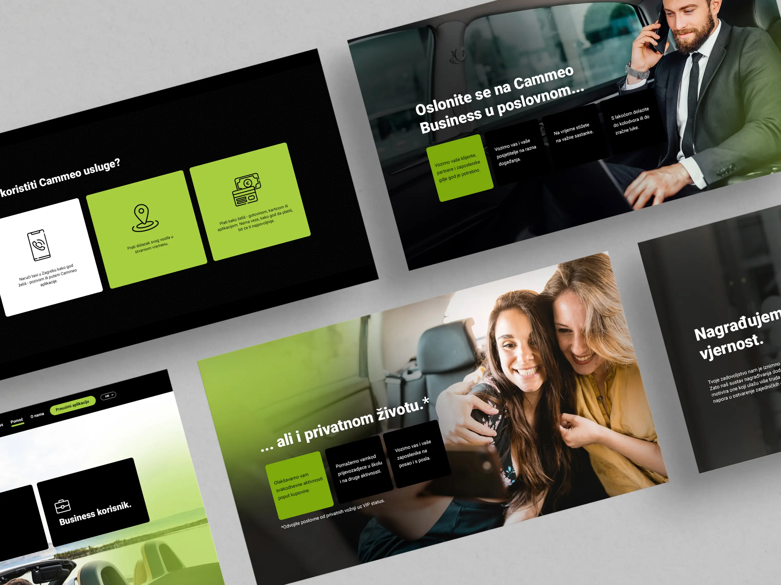
The redesigned information architecture puts the most common user actions first. A visitor should be able to understand what the service offers, check pricing or coverage, and either book a ride or download the app within seconds of landing on any page. No digging, no guessing.
The visual redesign uses large content blocks and full-width photography that transitions smoothly between sections. This approach does two things: it creates a modern, polished feel that competes visually with the interfaces of ride-hailing apps, and it gives each piece of information enough breathing room to be absorbed quickly.
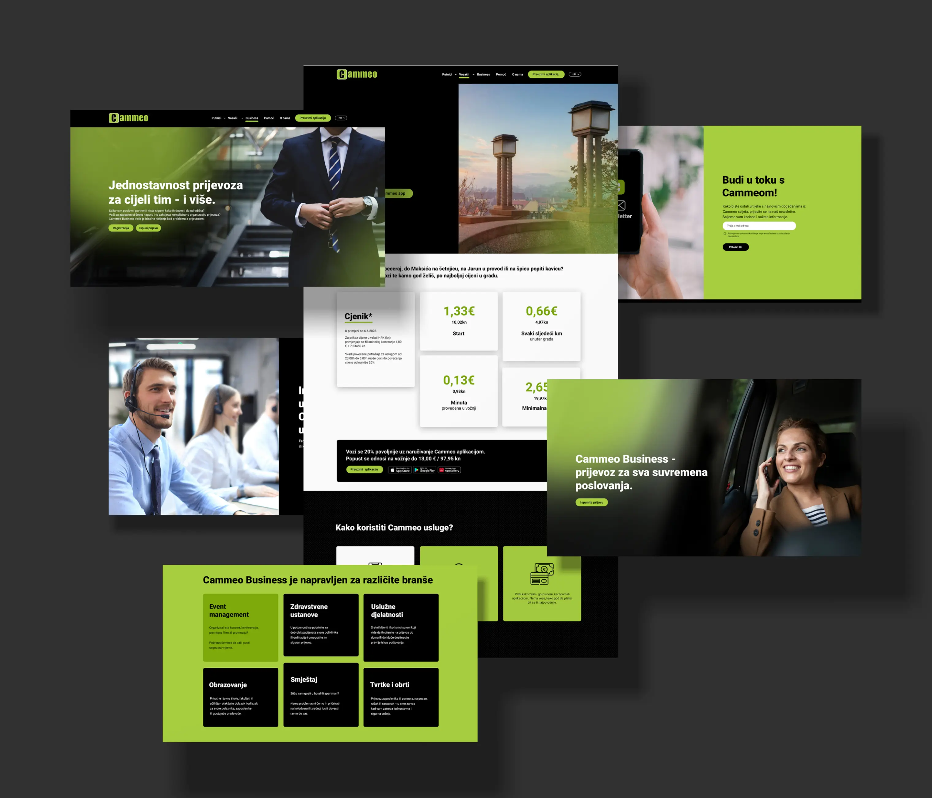
The rebrand was already coming when the redesign started, which changed how the whole thing had to be built. Cammeo was becoming Wizi: new name, new logo, new colours, new brand voice. The site needed to work for the company now and move to Wizi later without being rebuilt from scratch.
So the structure was kept independent of the brand sitting on top of it. Sections are organised around what a passenger needs rather than around brand messaging, and the visual system was built so the identity could be swapped without pulling the layouts apart.